(I'm assuming this is now gonna be a series, especially since I already have another city idea in mind)
I know this took longer than the past few pixel arts and that's because of 3 reasons:
Excuses Why I "Couldn't" Posted This Any Sooner
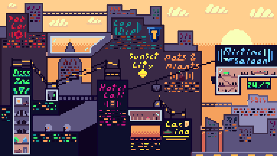
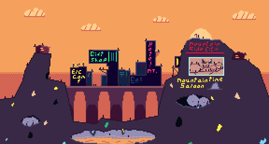
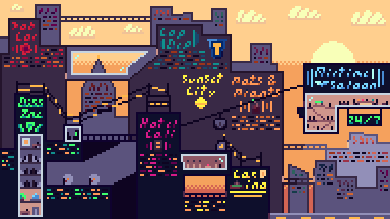
This is the biggest canvas size I ever done before (288x162 which is 50% bigger than 192x108 [The size of my last pixel art {SunSet City to be exact}]).
I got kind of lazy and to be 100% honest, this is where I usually wouldn't post for 2 months or so, but Anubi's city theme (Which is also gonna help make the next city pixel art) and the fact I already started on it before I started slacking made me push through in the end.
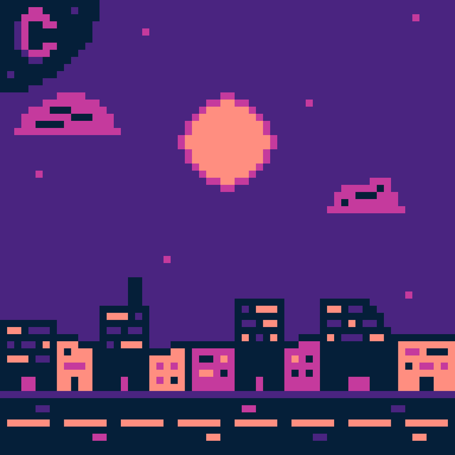
The palette lacked a lot of colors (Specifically in the purple area), so that made things harder along the whole way plus made the "People" way harder to see (Even now in the final product). This also is inspiring me to make some of my own palettes for this specific type of space pixel art, but we'll see if I'll go through with it.
Talking Ranting About Details Lmao
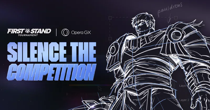
The "Synthwave Moon" as I'm now gonna call was a pretty cool idea that came in clutch as I was looking for some references on how to make a crescent moon. I came across this image:
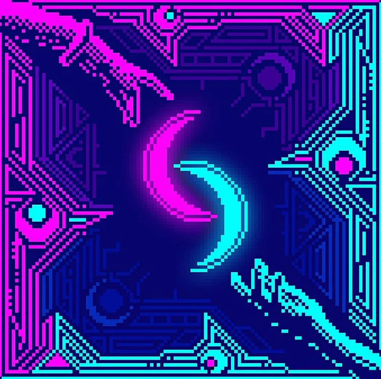
While being a really cool piece in general, the neon pink and the outer rim being disconnected really inspired me to go for that same look that the Synthwave sun has.
The "People" and the stars around the piece I put there last second because I felt it was too empty and wanted to make it look like a spectacle to the people living in the city. And so I added colored stars to certain areas and people sitting on top of buildings, on the bridge, and even on the asteroids (Crazy).
I really dislike how I completely forgot about the Cosmic City logo I wanted to add and had to shove it at the bottom in the end but it's whatever, ya live ya learn.
I feel very iffy on the font I made for the signs, I feel like the size I use them at is barely legible and at larger sizes it looks off, so I might make some changes to the font in the next one. (I guess while I'm on the topic of fonts, the Japanese lettering next to the hotel says, "Welcome" and the one by itself says, "Wave".
I really liked the paintings I did for the several landmarks in the area (Even one of the Airtime Saloon in the Spacetime Saloon), I felt like it really tied the place up and made it feel more realistic, plus it's cool.
Last thing for details, the black hole went through many, MANY stages because I'm stupid and don't know how to draw one. Luckily I got some help and now it looks amazing. Here are some previous versions of the black hole that I luckily have:
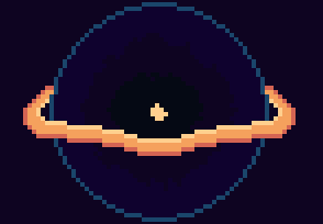
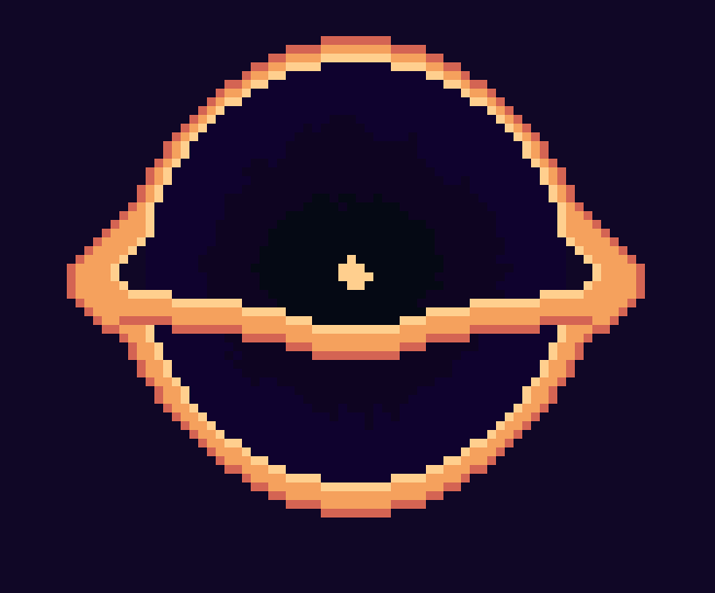
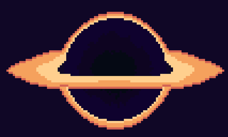
(Yea, what was I thinking with these)
What About Separate Layer Images Dissension?
Well ya see... My power went out before I finished the pixel art, thank God I actually save my pixel art a TON because of my fear of losing my progress. So I didn't lose my work, but I lost my layers, which was annoying. Hopefully next city pixel art will have layers to be shown.
After that pixel art THEN I'll probably move on to gamedev, but knowing how bad I keep my word online, I have no clue, I guess time will tell.
Short Conclusion
I sadly do not have much else to say rather than I hope to keep a consistent posting schedule thing going on (Maybe a post every week at the latest), but until then, adieu






2 comments