
Here is the evolution of my OC design, inspired by Diary of a Wimpy Kid. I was a huge fan as a kid and wanted to draw like Greg Heffley. I got myself a blank Diary from Walmart and that is when my drawing skills started to slowly improve. So, here we go!
Timeline:
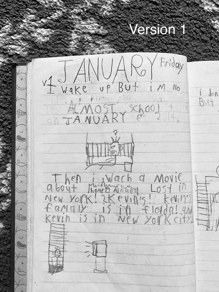
Version 1 - 2013:
The generation where it started it all! Well, started off weird, though. 
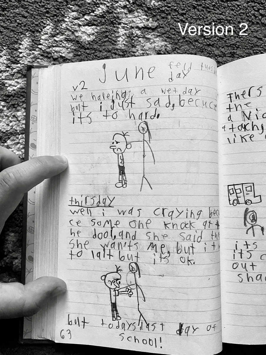
Version 2 - 2014:
The 3 pieces of hair were moved to the side of the head instead of at the very top.
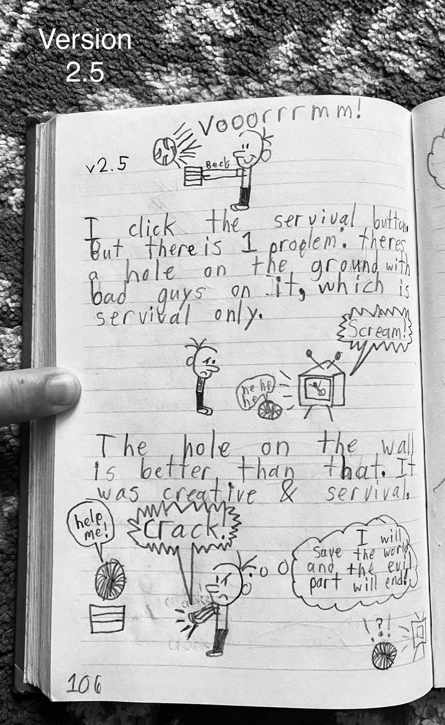
Version 2.5 - 2014:
The eyes are slowly turning into a line instead of a boring dot.
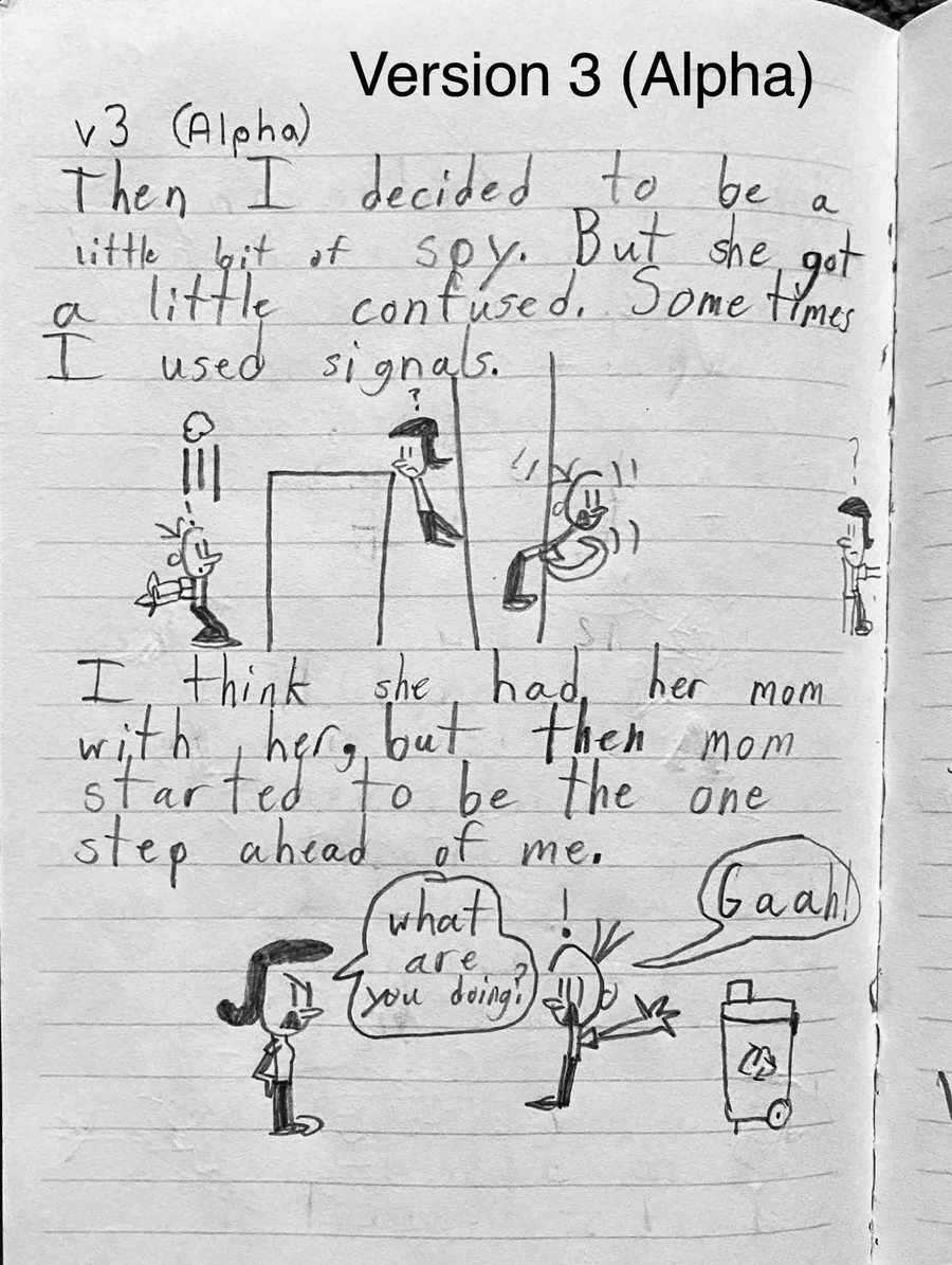
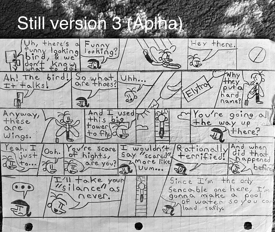
Version 3 (Alpha) - 2015 - 2017:
The head and nose look less fat and the eyes are now a long line. But in the comic, it looks fat again. 
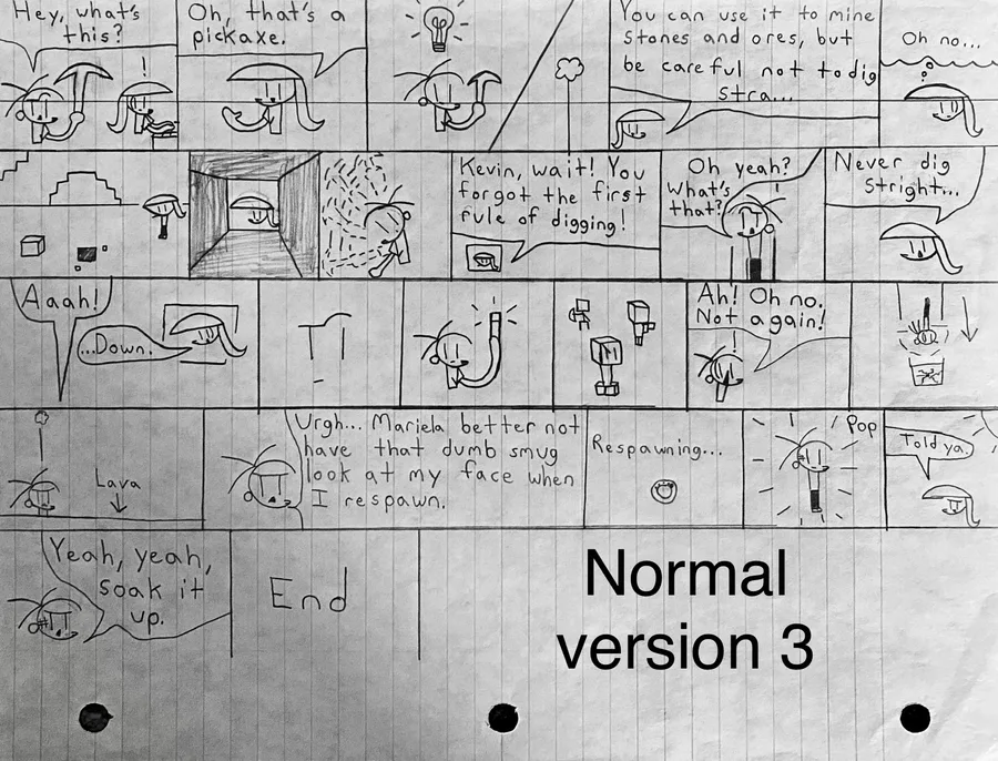
Version 3 - 2018:
The design is now skinnier and more smoother.
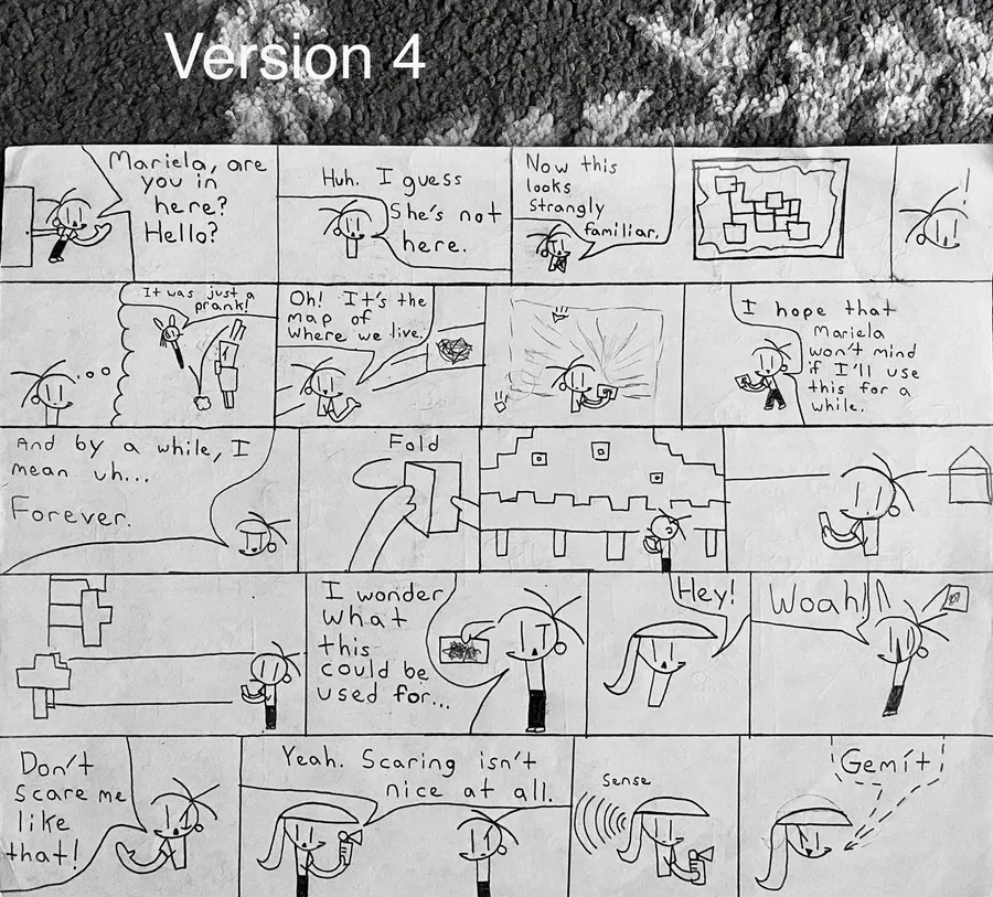
Version 4 - 2019:
The design still kind of remains the same as before but the head is slightly more smoother and the "Minis" version was invented.

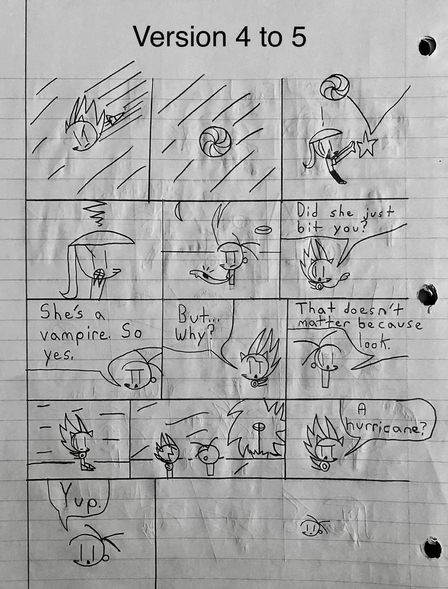
Version 5 - 2020:
The hair is slightly longer and a little more consistent head and eyes design, plus, the nose is now a triangle-point along with the head. What I mean is that the head looks a little like the G letter.
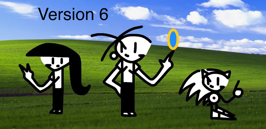
Version 6 - 2020:
The chin is becoming visible and the shoes are more shorter and sharper.
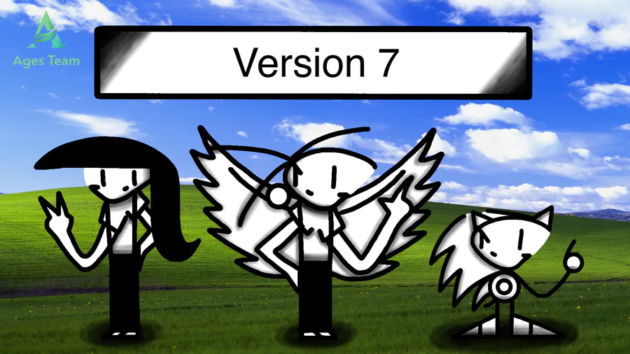
Version 7 - 2020:
Shadows/shading is a MAJOR update to the design! Slightly more 3D-looking (Not really though ), longer hair, and more consistent design.
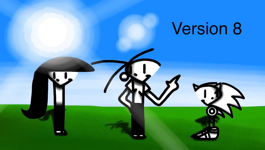
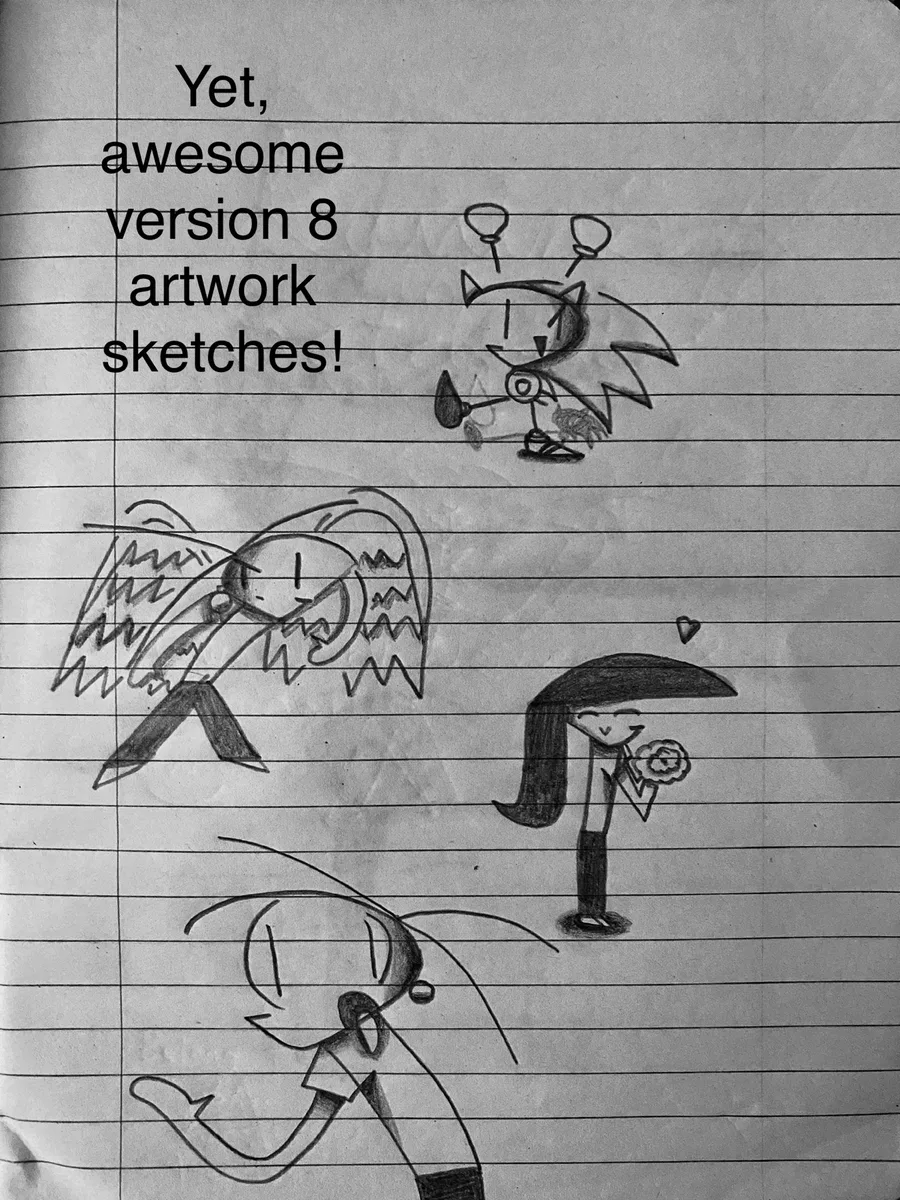
Version 8 - 2021 - Present (Now):
This is the last version, which is the current version today. More consistent shading and design, again , the head is now more shorter, and sharper, and the design is MUCH more smoother!
Man, it's really awesome how I started off as a rip-off into a spin-off! After looking back at these, this definitely made my artwork skills improve over time, both physically and digitally. Yet, I'm still drawing these OCs today. These are honestly good memories of mine, and I decided to share them with you guys! 😊
Well, stay safe and keep drawing your imaginations out! ✌️


8 comments