Warning!! Soup yap session
Last time, we left Puos in an ugly shaded state. Let's fix that!
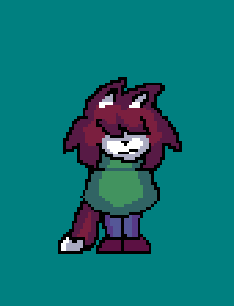
First, in order to shade, we must define a light source. Where's our theoretical sun gonna be at? In most cases, you can go with top-right. Now, for the actually shading! Try to think about your OC from a 3D perspective. Where are all the stand-out bits, the curves, bends, etc.? Remember that things in front will take up more light than things in the back.
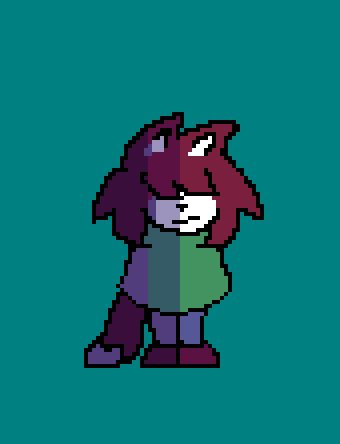
We're getting closer, but this would be an incorrect way to shade. I've see a few battle sprites that we shaded like this in the past. This look gross. You can see where the color bands, or the shift between colors, begin and end. You don't usually want that to be so obvious. You also don't see the light and shadows bending around Puos. With all this in mind, let's see the final result.
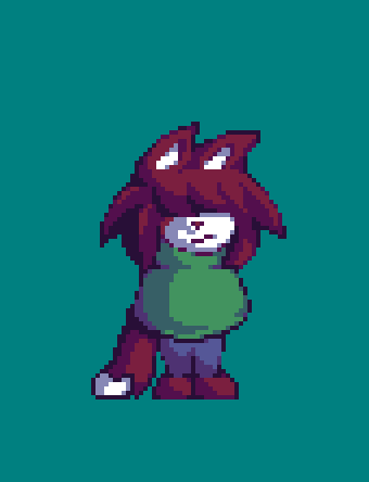
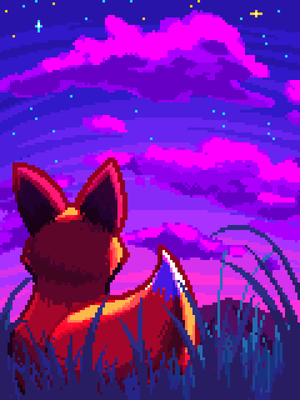
Beautiful!! Puos looks amazing! It has vibrant colors, shading that clearly highlight stand-out features like its hair, tail, muzzle, etc., you can see the fake sun's direction, and best of all is that it only uses 9 colors :D
Now this is great and all, and will work for most standard pixel art pieces, but what if you wanted to try different artstyles? Let's talk about artstyles!
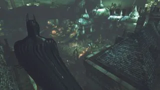
It's important to keep in mind what feeling you want your game, comic, art, etc. to invoke and how that ties into your project's artstyle. You wouldn't want a cozy, peaceful game to look like something that would come out of a Batman game, for instance.
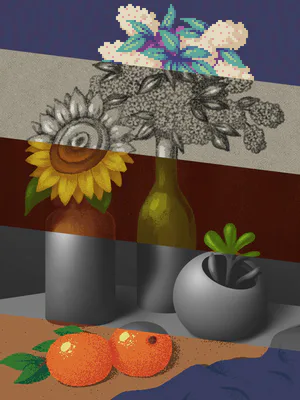
If you're going for something that looks more retro, then you'll want to use less colors and more vibrancy for your art pieces.
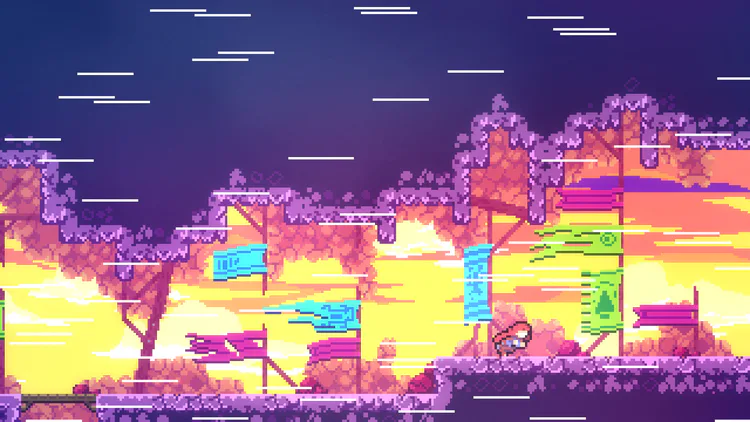
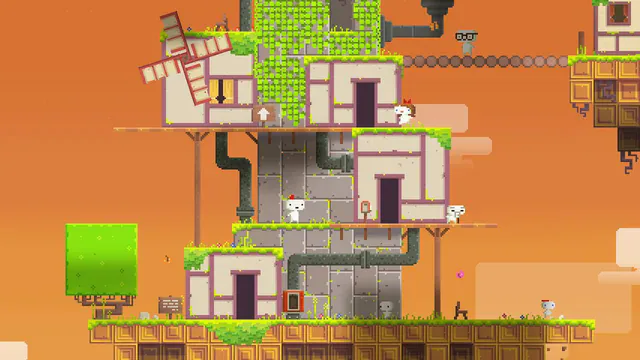
Going for an artstyle that looks like something out of an old painting? You'll want more desaturated colors.
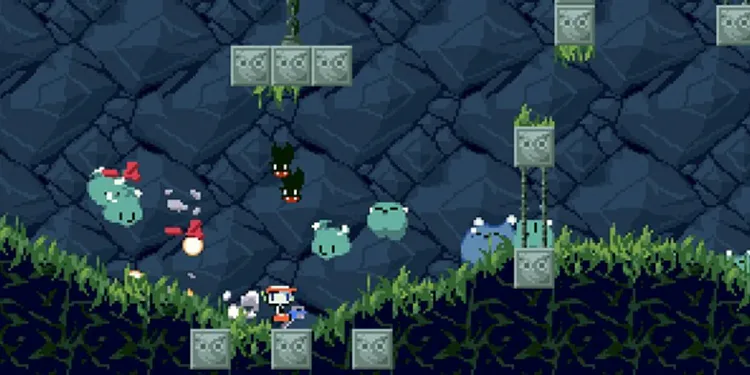
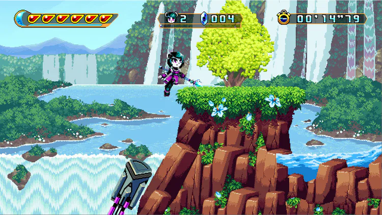
Are you tired of black outlines? You'll have to make it clear what is a background element and what is part of the foreground, now that you aren't relying on outlines to separate things for you. One way to do that is making backgrounds look desaturated the further away they are.

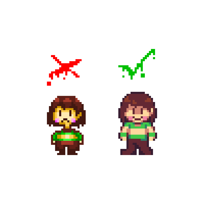
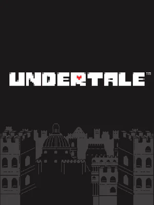
You can't just add shading to something that wasn't made with shading in mind and think it'll look all that great. This is why I, personally, hate looking at, say, Undertale remaster mods that just add color and shading to the battle sprites and call it a day.
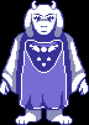
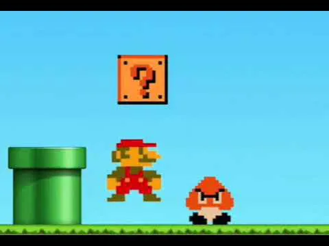
You may think this looks fine, but I think it looks really bad. It would be like the equivalent of adding a 4K texture pack to something that looks really blocky and pixelated. When I see people do this, it reminds me of the so retro Mario meme.
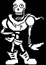
Undertale's battle sprites were made with only 2 colors in mind, black and white. There are details that intentionally don't show up and outlines that end abruptly cause our eyes are supposed to fill in those gaps and details for us. If you want to add shading to Undertale's battle sprites, don't. Make your own similar battle sprites with whatever artstyle you're wanting to achieve. That will look a lot better than looking like an average 2015 colored battle sprites mod.
That's all I have for you now, but I do have some tips I wanna share! These are not rules, just things to keep in mind that may help you on your pixel art journey.
1. Try to limit your use of black. Black is quite the harsh color and unless you want something to intentionally stand out and grab the viewer's attention, your use of black may look out-of-place in an otherwise vibrant, colorful game. What I like to do in place of black is use a very dark version of a primary color. For instance, here instead of using black...
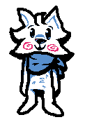
... I use a dark blue!

It makes outlines stand out just that much more without being too overbearing.
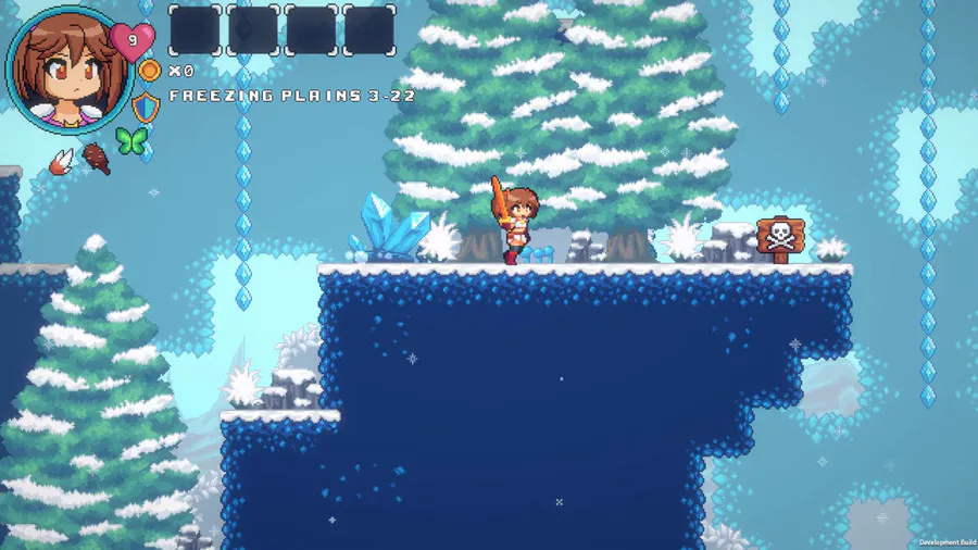
2. Learn about selective outlining. Selective Outlining is a shading technique in which carefully picked parts of an outline are either changed to a lighter primary color or is removed entirely. It's like an inbetween of lineless art and outlined art. I love using this wherever I can. Take a look at my UT Icebound fanart, for example:
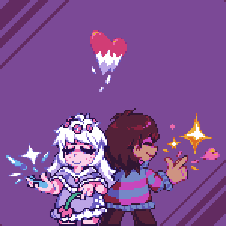
You can see lighter colors having more lightly colored outlines or no outlines at all(hair and skin), while darker colors will have outlines(clothes). This also helps with making pixel art pieces pop and even further helps with showing only important details being given outlines. You may also be able to see that I even use the outlines for shading. Every carefully picked color got a specific purpose to help make the piece all the more stunning to look at! You change just one pixel and it could change the whole vibe of the piece. Not kidding!
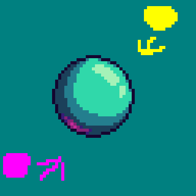
3. For shiny objects or for multiple light sources, you could try adding a backlight!
Anyways, now that's actually all. Stay soupy!! :)
















31 comments