

Next up
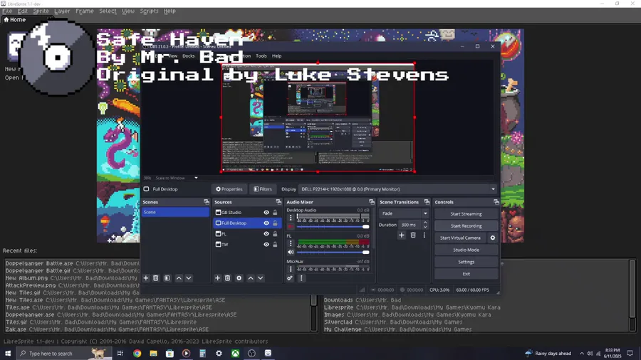
My cover of "Safe Haven" from GUIDANCE.
@LUKELCS 
 would you be so kind as to explain what the [[HYPERLINK BLOCKED]] twitter is doing in your eventing?

So
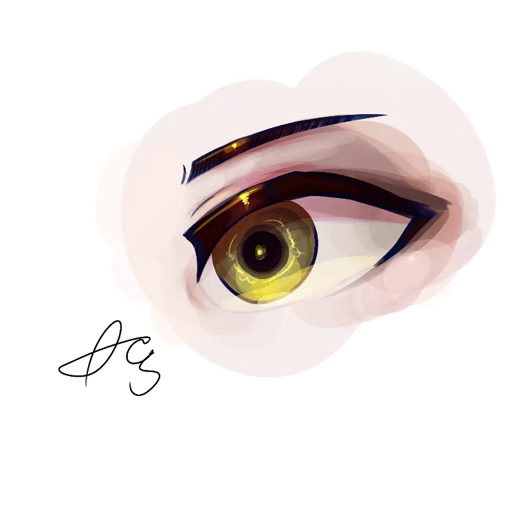
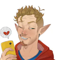
i may or may not make an full art of some person or i may just leave this like that-


Smile! Here, take some happy pills! ✨💊 #Blender #3DModelling #3DArt Buy me a Ko-fi: https://ko-fi.com/barbarafb_

What you all think
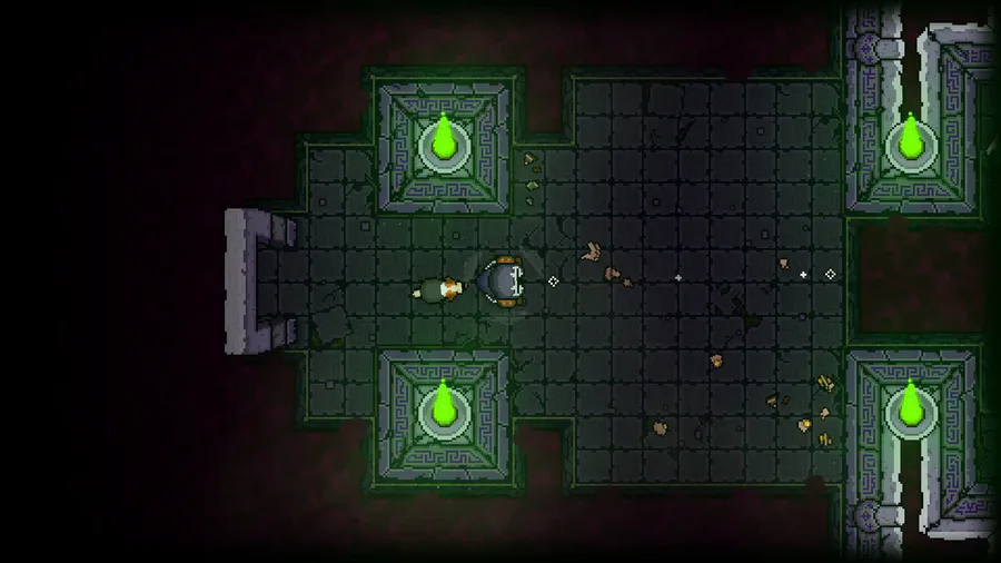
In the quest for accessibility, I'm adding Resurrection Shrines for players on the 'novice' end of the platforming spectrum.
In order to unlock the power of a Shrine, you must collect 3 'Souls' from your dead corpses! (the floating blue orbs)


Why walk when you can jump?


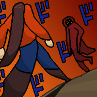
I worked so hard to get all four of them to the end safely, but then...
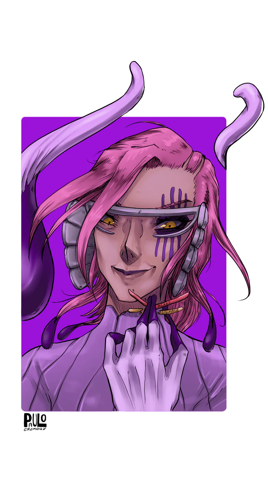
Szayel Aporro Granz - Bleach
0 comments