Comments (3)
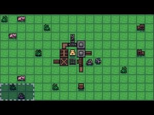
What is the point of the metal wood combo tree
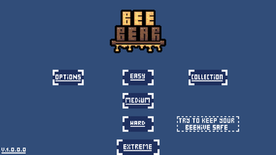
Adding a background to the main menu screen would be a good touch. Maybe a background of the inside of a beehive looking out of the entrance hole and seeing a bear, a honey background, or something else that fits your theme. You'd have to move the text and buttons, but it would make it feel more polished. Another thing is the back button in the options and collections is cut in half in the top right of my screen. Also quit game button on the main menu screen would be a good addition. It makes closing the application much more convenient. Something else that would be nice is a tutorial or even just some tips would make the game much easier to understand. When I first started playing I was confused on whether I was playing the game correctly. Lastly a timer that shows you how long you've survived for would make the experience more enjoyable. Your game is a good concept, and it just needs some more polishing to really shine. Good luck, and keep up the good work!
BeeBear V 1.0.0.1
A strategy game where you merge blocks to upgrade them, with a pixel art style #adventure #platformer #survival #strategy #pixelart #arcade #pointnclick #action #retro #pixel
