I’m continuing to port my ASCII UI to pixelart. I’ve changed the inventory. Here’s how it was:
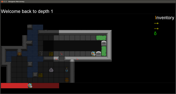
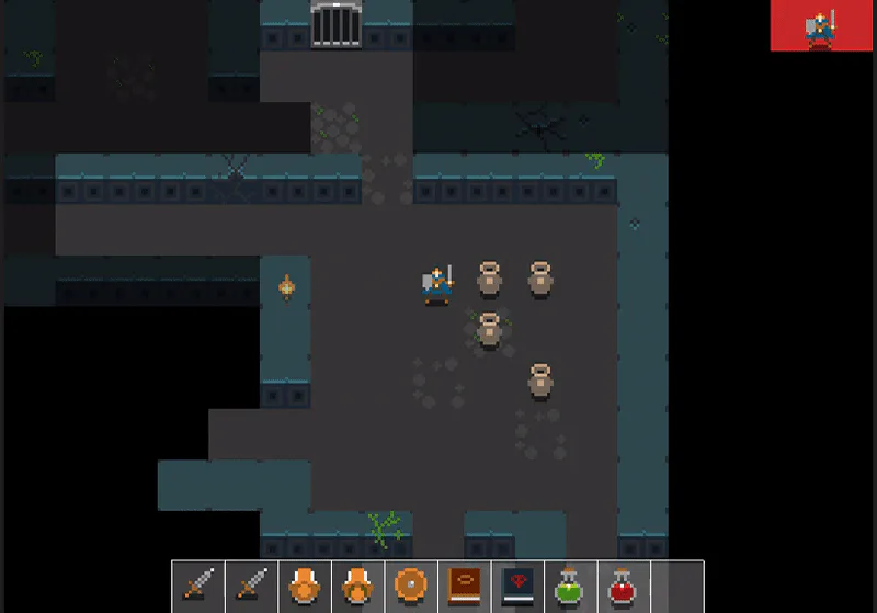
and how it is now (inventory border looks a bit glitchy on the screenshot, but it isn’t):
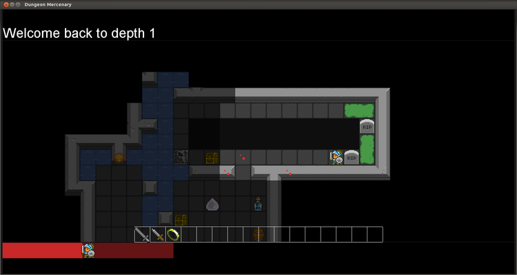
This change will also leave space in the UI to move the “health bars” panel (see previous devlog) to the right, and make it vertical. I think it makes more sense to have the bars vertical, since width is not much required. Please voice your opinion, it’s very much appreciated!



0 comments