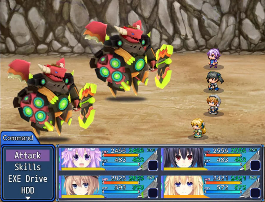
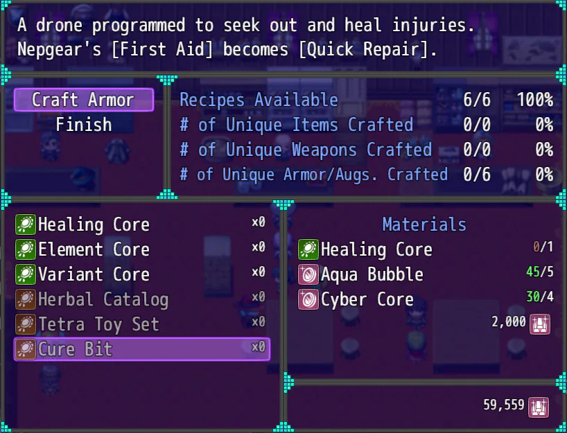
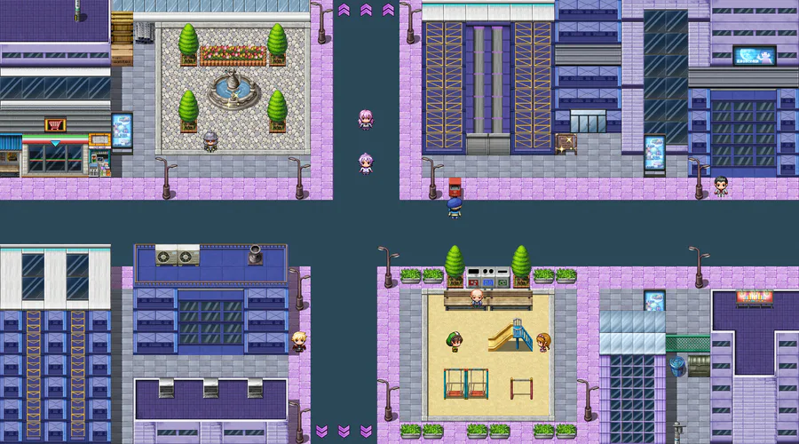
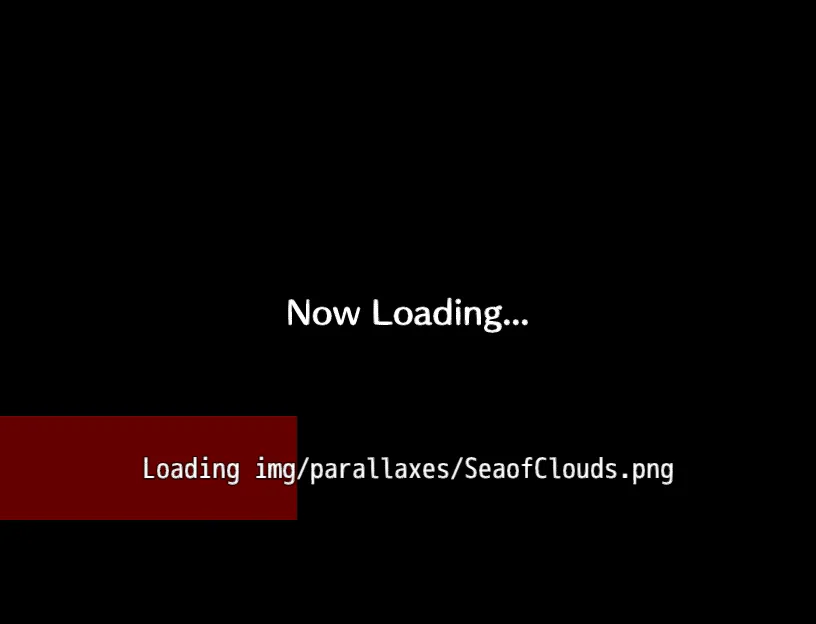
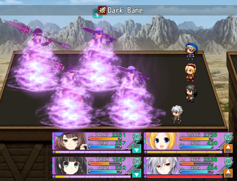
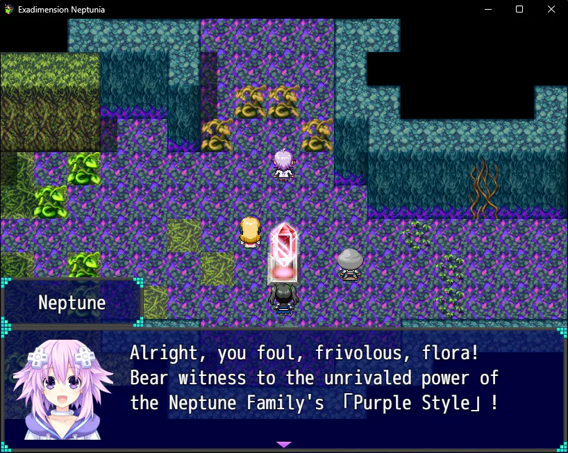
Now that work on Gold Third is finished*, I’ve focused my attention on making this game look less like a generic RPGMaker game. The font is the biggest culprit, but as of now I cannot find a good replacement**. With that said, I decided to change everything else instead. Here are the results:
Everything here is most certainly not final. I may change a few things here and there, but the position of everything will likely be what you see now. I am not sure when the next major update will be, but rest assured that I am still working on this game whenever I can. Thanks for reading!
*I made sure that they would be fun to use, but also strong enough to be useful in battle. Actually, I think I may have made them TOO strong. I have solutions obviously, but they will be incorporated into the story.
**To be honest, it has kinda grown on me, the way each letter number and symbol have the exactly the same size, and are perfectly aligned.


1 comment