Almost there
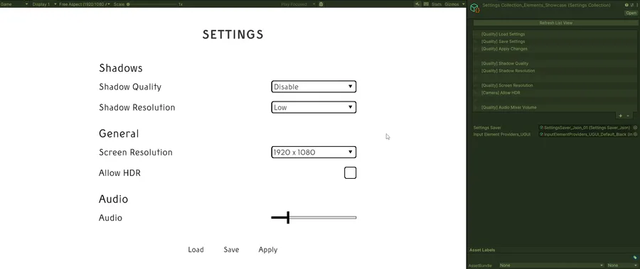
This week’s focus was on feature parity between the 2 Unity UI systems and various small but important and impactful feature additions such as the horizontal selector (input where you can cycle through the different options with a previous and next button on the sides) which is used in many game settings/option menus. Up until now I built the menus using existing input elements that Unity offers by default such as a toggle, slider or dropdown. Since a vast majority of games use horizontal selectors it was only natural to also create one for the asset. With a focus on ease of use and flexibility for the asset I also took the time this week to essentially make all those input elements compatible with different types of data. For example if you have a game in which you want to be able to turn shadows on or off it’s not uncommon to represent it as a toggle input. However I’ve seen many also use a horizontal selector in which you just switch between the on or off state. To make it easy on the creator I’ve done some modifications to my data processing that allows the developer to not care much about using the correct or compatible input element. This means you can use all 4 elements (slider, toggle, dropdown or horizontal selector) to be used with your shadow on/off option. In this case the slider would automatically be representing 2 states, the dropdown and horizontal selector automatically be populated with the on or off options. A flexible data conversion system makes sure that in the end the correct data is provided to the necessary system that changes the actual setting such as turning the shadows on or off. I also extended the system that creates the default input element. It now is a list in which you can drag and drop your preferred element for various types into. For example if you want a more uniform menu you could drag the same element (for example the horizontal selector) in all the different types and all the different options in your menu would use the same element. Of course there are some limitations for things like sound volume which can not be easily represented with anything but a slider as it requires a range of values. Using a dropdown or toggle wouldn’t make much sense. For that I added support for the various options to override the default element when it requires it. All those features combined make it very simple for the developer to create the menu without worrying about the creation and placement of necessary inputs. Thanks to how the default element list is provided it’s also just a matter of a few seconds to completely change your menu from using dropdowns to horizontal selectors. Support to override the input element on a per setting is also available in the case you want it to be different from the automatically provided one. I’ve only managed to create the horizontal selector for the old UI system this week so I will also create it alongside the other new features for the new UI system this week. I’ve added a bunch of other small quality of life features too but I’d rather show them off in a proper showcase when everything is done. That’s all I had time for this week as I’ve been taking things a bit slower cause I’ve been dealing with a cold throughout the week from which I still haven’t recovered fully.
Notable tasks this week:
Further development of the settings/options menu asset
Wishlist on Steam
Join the Discord
That’s all I got this week. I hope you are all doing well.
Stay safe out there and I’ll see you next week.




0 comments