I forgot February only has 28 days.
I forgot February only has 28 days. And so, we come to the "CBrainz end" of February on this beautiful night of the 3rd of march.

Unfortunately, I ended up hitting several brain blanks when actually translating my ideas for the battle system into an actual HUD with the code that goes along with it. Comes to show that, even should you write everything down beforehand, actual production is actually a lot harder to pull off afterward.

But still, the HUD is now almost fully finished. And so, the video production will soon start and release on the following days as promised.
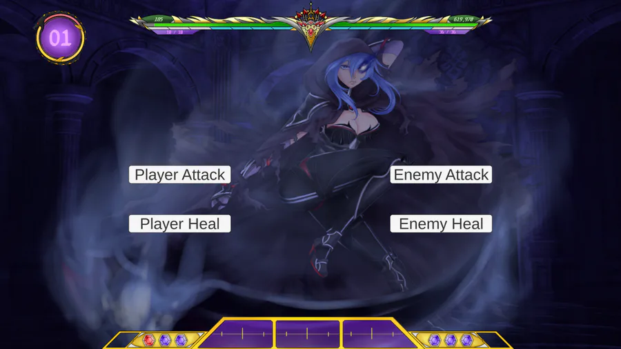
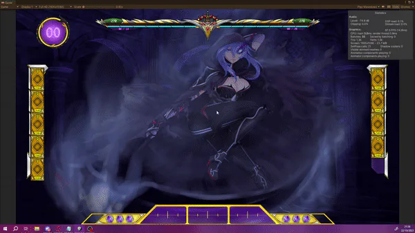
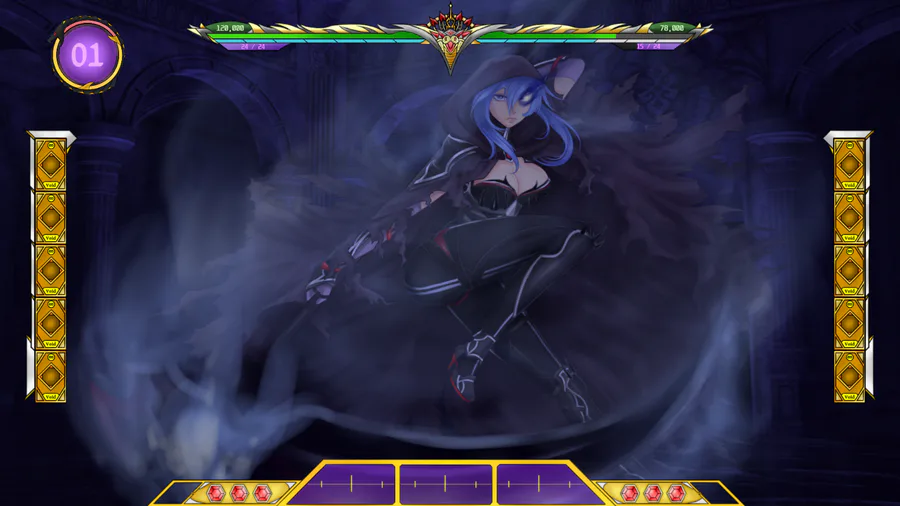
Until then, I present to you the Point Origin : Servant to the Monster lord reforged battle system's HUD! (With some quick explanations as well, of course.)
And as a little bonus, all the conceptualizing that eventually led to it's final version as well! So you can get a trip down my brain goop as well.
See ya soon on the game presentation video!
The SML battle system
Once, a long time ago in a galaxy far, far away.. Some dude decided to change his Monster Girl Quest mod with a new battle system, since he thought the original one was crap. (Like, bad levels of crap.)
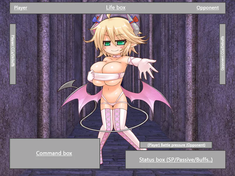
Designing various concepts arts to revolutionize everything, he finally ended up planting the first seeds which would eventually lead to the future SotML battle system through one simple mechanic : A Ring Controller.
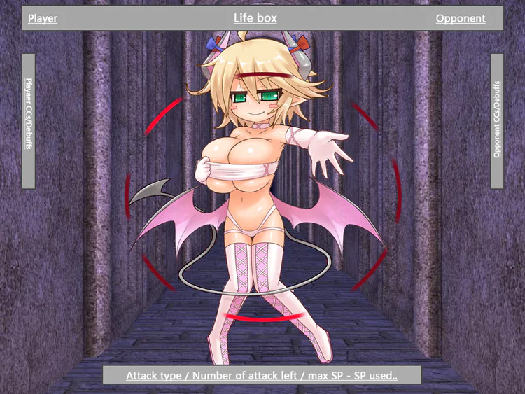
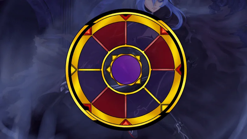
Whereas the player and the enemy would fight one another through the use of angles, represented by arrows that would point in 8 different directions. Which would, as such, form a circle. (Which he renamed ring 'cause it sounded cooler.)
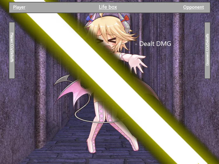
And so it was. Pick an arrow, slap the opponent through there, and boom. You have a new battle system. So he went ahead, and then started to work on designing his first HUD.
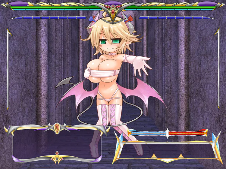
Forced to work with only a 800x600 resolution, he was frustrated stuff wouldn't fit well, and thus tried a lot of dumb stuff that didn't work. But, in the end, was still happy with his finest piece of HUD : The Ring Itself.
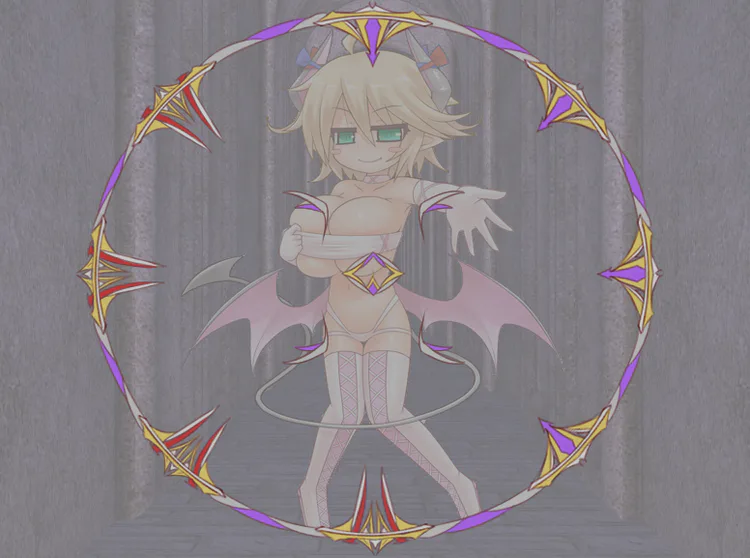
A beautiful, yet extremely thicc, piece of HUD. Yet, in the end, through endless changes into SML base gameplay and let us say, a not so stable IRL life, the project was unfortunately buried beyond repair.. Until today.
The SotML "Reforged" battle system.
Thus, we arrive to today. When an older, and far worse version of him if I may add to that, finally decided to pull his fingers out of his rectal walls, and get his concept translated into a new, functional, and modern looking battle system.
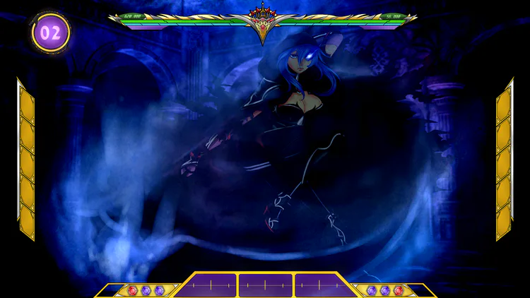
Armed with a magnificent increase to 1920x1080 resolution, rusted skills with the drawing tablet and a few more games played under his belt, our present Cbrainz managed to cut out the stuff that was, as he would say himself : "F*cking useless to show to the player and goddamn ugly too" in order to produce a more modern and lightweight HUD.
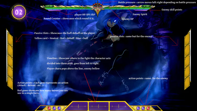
And while you may not have any idea of what any of these words mean for now, I sure as hell hope you'll come to pat him on the back on the design. 'Cause he'll probably cry about it otherwise.
Now, one as smart (lies) as you would probably have noticed that there are no ways to actually make an action in the HUD up above. (And if you have not, then do not be alarmed. You probably have enough neurones left to cry at the realization that you missed this fundamental flaw now.)
And the answer to this is simply that the control menu only appears... By clicking on the character you are facing.
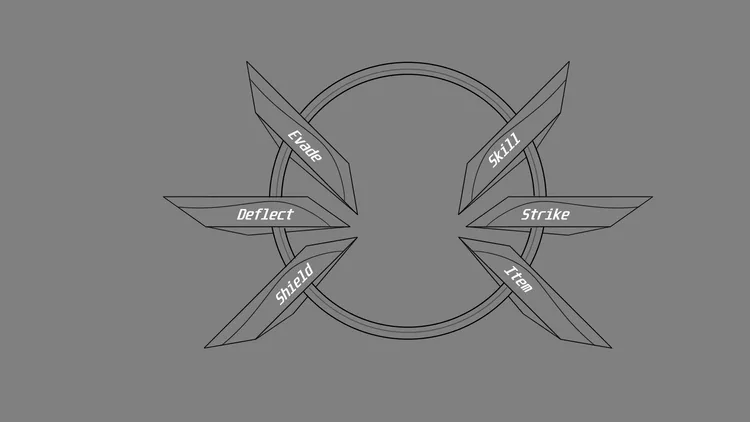
The "Action menu" will then grace you with it's presence, allowing you to make your pick on the target of your choice. Thus, allowing to remove clutter, and create a more dynamic controller to pick your poison with.
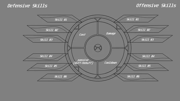
These designs were hard to come up with, as our dear Cbrainz was far too focussed (More like obsessed) with the idea of having "Not a single one of those god forsaken boxes with text on them". Leading to a more advanced design which reminds of the ring controller itself.
..Yes. Our dear cbrainz, apparently, REALLY likes circles.
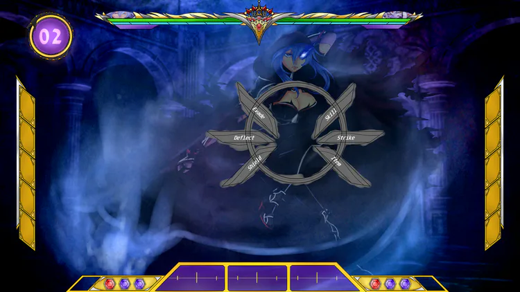
As of right now, the last elements to do are :
- Add in the colour scheme of the "action menu"
- Figure out how big the action menu should be compared to the rest of the HUD
- Figure out which portion of the HUD can be hidden when the action menu appears.
Once that's done, The HUD will finally be complete.
A little bonus to the well trained boiz.
And as a little bonus to those who have read through it all, here is the old relic our dear mini cbrainz designed back when he felt some sort of happiness in his heart :
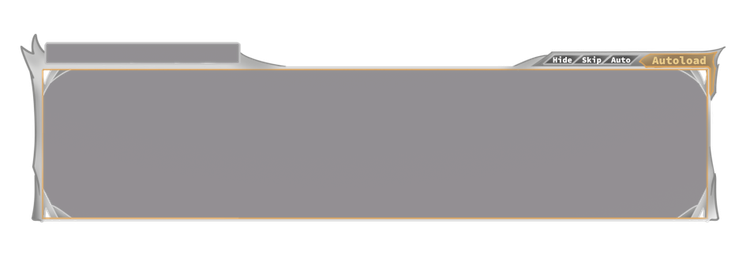
That's right. It's the text box. You know, the stuff in which text appears in a visual novel? Our young Cbrainz had made a new one. (He thought his little SML deserved a new one.)
Thus, with some polish and modernisation, this will eventually turn into the SotML.. Reforged.. Text box system?
..Man I really gotta stop putting "System" at the end of everything I create..

0 comments