
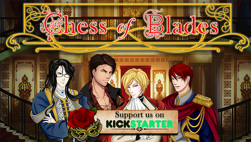
Last update of the week! While our artists are busy working away on characters and backgrounds, us devs are beginning to make the graphics for our upcoming Kickstarter campaign, to be launched around March 5, 2017. Keep on the lookout!
The banners I’m talking about are the themed ones that separate sections of information on a KS campaign.

You can tell how low budget and uncreative we were for our Requiescence banner. We are determined to do better for Chess of Blades! If only slightly!!
(P.S. Since I am absolutely design incompetent, I badgered Dovah to start working on the banners; shhh keep it a secret.)
First version Dovah sent me:

Uhh…those masks….are kinda creepy and not really the kind you would see at a masquerade ball.
Next version:

Eh…the shape of the flag in the back is kinda ugly? It looks way too fat for the text. The cream color is kind of too clashy/plain with the fancy rose and the white text. You also can’t see that mask on top of the rose. I almost missed it again while writing up this log.
Next!

Not bad? That rose is way giant though. Again, that mask color is impossible to see. Even though the font is the same as before, it looks especially boring and ugly since there is less stroke/shadow.

I don’t know what happened to the red O, but the mask looks a little more visible and the overall feel of the image isn’t so off-balance. But the banner itself still looks too skinny/plain?

Now the banner is super fat and the text looks like it is photoshopped badly on top of the banner =.=. We can do different colored masks for the different sections, but the overall look still…blech. Unbalanced.
Needless to say…we are still working on these things ==;;. If anyone has suggestions, we are open!! Please send them! All the help! :D If they are super awesome, we will showcase them all over our KS! (with proper credit of course).


0 comments