Yeah, there was no February Devlog because February isn't real.
Anyway, hi, progress has been good. Let's talk about that progress. You guys like progress? I love progress.
As I said at the end of the last devlog, it's finally time to work on that sweet, sweet multiplayer functionality you've all been waiting for. Before we get into the nitty gritty of that though, obviously there needs to be a way to select between the game's short singleplayer campaign and the actual online multiplayer game. With a lot of the prior enginework, I had to make UI designs that fit with pre-existing design, which imposed limitations that made it easier to come up with ideas for those. However, this would be a completely brand-new screen. One that should, ideally, still fit the general aesthetics of UNDERTALE and DELTARUNE, but other than that had no real limitations to work around.
Typically, I refer to the singleplayer campaign as just "MYSTERYTALE" and the online multiplayer mode as "MYSTERYTALE Online", so it'd make sense to name the modes such when choosing between them. Since those sound less like "mode names" and more like "game names" (if that makes sense), I thought I'd base it off games like Super Mario 3D World + Bowser's Fury or Sonic X Shadow Generations, games that are effectively two games in one package and have title screens that let you choose between the two games. Additionally, I thought I'd throw in some inspiration from Super Mario All-Stars on SNES as well.

This is the first mockup I made with that idea in mind. Wheras Bowser's Fury and Shadow Generations are laid out horizontally and have big artworks to go with them, I figured something more "lowkey" with just the titles would work out decently well for an Undertale-esque style. And since the titles themselves are horizontal and could be easily stacked above each other while remaining readable, it made sense to go for a vertical approach to this design.
Around this time I also made the choice to use two different logos for both modes, y'know, apart from the word "online". During conceptualization, I figured that having nearly identical images next to each other with minimal differences wouldn't be very visually appealing.

(Altered mockup with both modes using the same logo)
Conveniently, two of our spriters had actually made two separate concepts for what the title could look like, both of which had things I liked about them compared to the other. So, I decided to use both logo designs, and I think that decision was probably for the better.
Afterwards, I ended up messing around a bit more with potential designs and ended up landing on this:

I'm pretty happy with how it turned out. And it even uses the old login theme that some of you might know as "Welcome to Undernet!" or something along those lines. Since the newer login screen has a very different atmosphere, I wasn't really sure where to use that song in the future, so I'm very happy to have found a place for it here.
For anyody curious, here's what the mockup for this design looked like:

I wonder if I should rename the GameJolt page to "MYSTERYTALE + Online" once both modes are properly implemented. It'd be a subtle change that'd get the point across.
Of course there were some other scrapped ideas for the mode/game selection screen, such as something based off Deltarune's chapter select screen (since they fulfill effectively the same purpose). But ultimately, I think that what we ended up with is probably better.
Anyways, we have our mode select, now it's time to actually add multiplayer functionality. But first, let's discuss about how multiplayer was implemented into MTO Legacy.
As I'm sure many of you know, MTO Legacy used an extension / service called "GameMakerServer", an all-in-one extension to make multiplayer games in GameMakerStudio 1.4. In all honesty, it was an incredible extension and I'm not sure I've ever properly expressed just how incredible of a job Size43 has done with it. It was incredibly easy to use and allowed anybody to make an online multiplayer game very easily. I've seen games that could neither figure out how to keep a consistent window size, nor how to actually change the player's set of sprites be able to implement basic multiplayer thanks to it. The service had some downsides, such as being a little restrictive in a few areas, not functioning with Studio 2 and not functioning with YYC, which made games using it incredibly easy to decompile and modify, which, as you can imagine, isn't ideal for a multiplayer game. However, it cannot be understated how user-friendly it was and how much work it took off developers' backs, not even requiring you to host your own servers. There are a lot of good times that were had thanks to this incredible extension, so for every single person out there who has made or enjoyed even just a single game using it, I want to say "Thank you" to Size.
With that said though, as most of you are probably also aware, GameMakerServer is going offline at... well, in December of 2023, which is.. in the past now, so the service is kind of in limbo at the time of writing. It may go permanently offline at any moment.
Long story short, going into this new version of the game, I knew I couldn't use GameMakerServer anymore. This did make for a good opportunity to move over to GameMaker Studio 2 (now rebranded to just "GameMaker") and start using YYC though. But now, I had to find an alternative way of going about multiplayer functionality. While I am aware of projects being developed that are meant to act as spiritual successors to GameMakerServer, I was really on the fence about whether or not to use those. While they would make things a lot more convenient to me, I hadn't really given it much thought before how hard it must've been to create and upkeep GameMakerServer, and although I do think those projects have a lot of potential, I think it might be a bit too early for me to gamble on them. Additionally, it would've simply been nice to remain free of certain limitations.
GameMaker's built-in netcode functionality isn't exactly super ideal either, seeing as the program can't really compile programs that don't require a window. So, this would mean that the server would need to be a graphical server, which, as far as I'm aware, are more expensive.
Eventually, I came across an open-source server framework that sounded just perfect, and that's where we're at now. So, I'd like to give a big ol' shoutout to evolutionleo for making a server framework so I don't have to. That said, using it is nothing like GameMakerServer and is a lot more complicated. It involves tinkering directly with the server software and tweaking a bunch of stuff that took me a good while to get right, not to mention you do still need a proper place to run the server software (i.e. a Virtual Private Server or a physical server). So, I really do not recommend just any beginner to mess around with it. Even getting the demo project to work requires some tinkering. But when it works, it works really well. And I got it working. So now I'm happy.
Now, obviously, the very first part was to actually connect to the server and be able to display Ping. Easy enough.

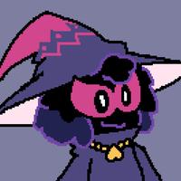
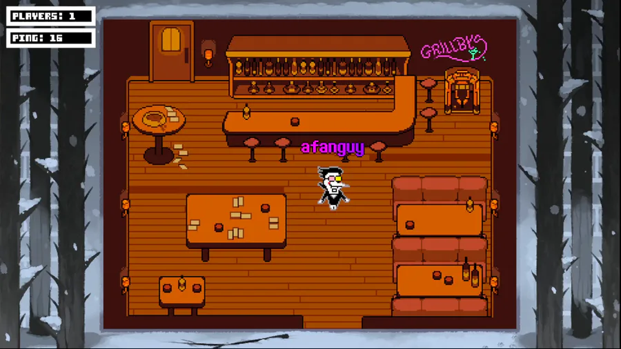
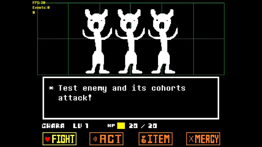
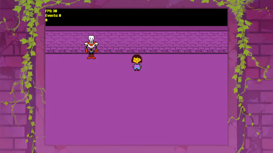
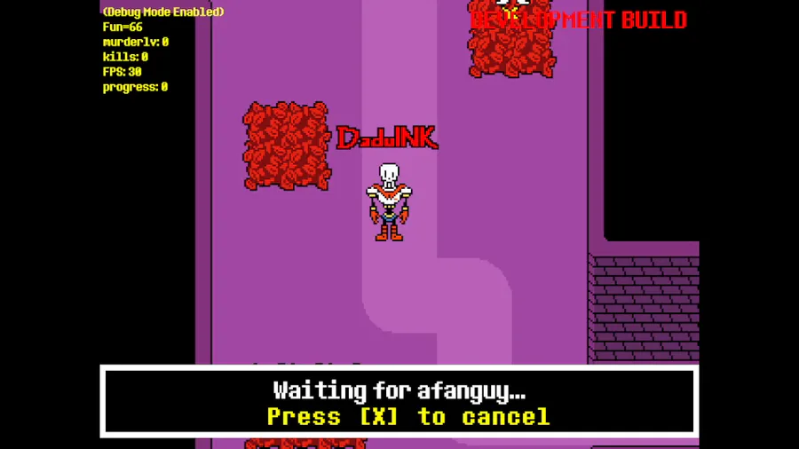
Right, but then there's the much more difficult part. Actually synchronizing the player characters. This took me.. a while, to be honest. Now, like any good developer, I love to just synchronize coordinates in a map and using some placeholder asset to actually represent other players during early development. But instead of using some boring old cylinder, I used our good friend Test Monster over here.

Look at him, isn't he just precious? Now, on the day that I did as much, I figured I'd take a break and let test monster have some more time in the spotlight.
But then I got really bored and actually synchronized player animation data on that same day after all. I'm sorry, test monster.

Anyway, one small issue with the way this server works (or at least how I set things up) opposed to GameMakerServer is that there's actually a small delay before players properly load when you or they move between rooms. So, to mask this, I added a little fading effect to when other players appear or disappear on your screen.

This effect is very similar to one seen in Yume Nikki Online, which I'd highly recommend to anybody reading this. The effect also just.. looks nice.
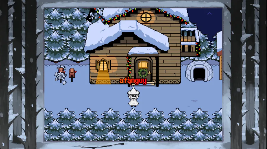
But what's a multiplayer game if you can't see anybody else's names? So, it was time to finally add those to the game. And they look about the same as they always have and provide the same options as always.

Outlined, dropshadow, plain. The classic display modes as you remember them.

And of course, the opacity option is back, too! Except, do you notice something different? Let's compare this to its counterpart in MTO Legacy.

In MTO Legacy, the opacity effect looked.. Off. It'd make the actual color of the name much darker than before. Why is that?

If we take a closer look, we can see some kind of weird artifacting going on here. So, let me explain what's happening here. GameMaker doesn't natively have any functionality to draw outlines around things, so, to achieve this effect, the game draws multiple copies of the text around the same text, but in black.

By drawing 4 copies of the exact same text, ever so slightly offset but stacked atop each other, we can create the illusion of an outline. However, once we try to individually apply transparency effects to each of these copies, the illusion starts to break a little. Because when two transparent things overlap, their opacity, typically, adds up. (This technically depends on the blend modes used for rendering, but we're using regular blending in this case)

Our visual red name here is now slightly transparent, which means you can see the black copy of itself behind it, which makes the text look darker. And depending on where the copies overlap with each other, some parts look darker than others, creating this weird artifacting effect.
That said, one of my two newest programming obsessions as of this new version of the game, being surfaces, comes in handy to fix this little issue, and is an effect I already had to implement for the character outlines in the Deltarune Bullet Areas. Effectively, a surface is somewhat like a new graphics layer. To simplify things, we can render multiple things together, then treat all of them as one graphics element to modify. This way, we can draw the pseudo-outlines just like before, but treat it as a single graphics elements together with the main text, and apply the transparency effect to this collective graphics element, which results in a much better effect. Maybe this same effect could've been implemented by using different blend modes, but I love surfaces.
That is a lot of nerd talk for a single effect, so let's move on from that.
Obviously, aside from that, the small font option also persists,
along with the options to display HP bars and LV.

It may be a little harder to read, but it's more compact. Either way, it's an option, so you can choose whichever you prefer. And, obviously, all these options can be combined with each other just like before. I have yet to actually add a settings menu for these, but the actual functionality is there.
With nametags out of the way, there was something very important and integral to the game I wanted to tackle - skins.
When first developing MTO Legacy, the first skin I ever added, besides default ol' Frisk, was Papyrus. So, I thought it'd be only fitting to start with Papyrus again. And so I did.

Now, the skin system itself is a lot different from how it work in MTO Legacy, at least on the technical side of things. In terms of gameplay, there isn't much difference, aside from the fact that opening a skin's costume menu won't change your skin anymore.
MTO Legacy's skin system was a huge switch case. Basically, the game would check what your current skin is, then set your sprites, font and some other variables accordingly. Here's an example of what this looked like in MTO Legacy.

This was... not ideal in the slightest. There's even a typo in there! One of the biggest downsides of this approach was the fact that the game couldn't get data relating to a specific skin unless it was your active skin. This is why in MTO Legacy, opening a skin's costume menu would change your skin, since it couldn't actually get the data for that costume any other way. Also, it's just an impractical mess. Let's compare that to how Papyrus' skin setup looks in the new game.

The skin system uses my other newfound programming obsession - data structs. To simplify things, it's a means of handling data in a way where you can access values via names and I've been using these a lot in the new engine so far. If I want to get a specific piece of data from a skin, I can just tell the game "hey, get me the icon of the skin called 'papyrus'" or something like that.
Observant ones may also have noticed some other differences. For instance, rather than having a single fixed font, skins can now have multiple "voices". I will elaborate on this more when I work on the chat system, but for the time being, just know that this would allow characters like Flowey, Sans or Crossbones to be able to freely cycle between different ways of talking in chat. If you're curious about any of the other values, "actor" refers to a set of animation data (which can be changed without changing the skin/costume), "icon" refers to the image displayed for that skin within the skin menu (which was previously defined in Legacy's skin menu), "description" will be elaborated on later, "buttons" refers to the battle buttons that skin has access to in battle (ITEM will be replaced with ACT for papyrus later down the line), "spelllist" and "skilllist" refer to that character's respective spells and skills (currently placeholders from MT's papyrus party member, these will be changed slightly), "battleskin" refers to the graphics used to display the action buttons during battle for this skin and "portraits" refers to a list of different sprites used for portraits in chat (there are a lot of new ones taken from different sources).
What does this mean for you as the player? Now you can check Papyrus' costumes without becoming Papyrus. And maybe you'll see some cool things I couldn't do with Legacy's skin system.
Last but not least for this devlog, the final feature I implemented is the new skin menu. At first, I thought I'd just reuse Legacy's design, but one thing I've always wanted to do was being able to display just a little more information, even back during Legacy's development.

Here's an old concept menu from Legacy's development, back when the PvP System would've been disconnected from the regular battle system and would've had fixed stats for each character. While I'm glad we didn't go with this, I think you can see how I've always wanted to be able to display just a little bit more info. But especially since we moved from a list format to an icon format, this would be a lot harder to pull off. That said, I started making some mockups and trying to come up with ideas.

My first idea was very close to Legacy's design, just with a little "info box" at the bottom. However, this design felt a little cramped.

Design 2 removed the menu windows on the left, widened and centered the skin windows, and added a scroll indicator like the one seen in the JP Battle Inventory. It also finally shows what the little info box wouldve been used for. However, I felt like the scroll indicator was a little too big, same with the information text in the info window.


Design 3, which also finally included a Costume Selection, fixed the aforementioned issues I had, while also adding descriptions and a general indicator for what specific category you're currently in.

This mockup is just Design 3 again, but with info indicators added in, since someone pointed out that it'd still be nice to tell at a glance which skins have spells and such. Additionally, I figured that placing the icons directly next to the actual counters would more easily convey what the icons are supposed to mean, as opposed to that information being hidden away in a Help Menu that nobody uses.
I'm actually pretty happy with this design and it almost ended up being the one actually implemented in the game, if it wasn't for a last minute suggestion a friend of mine made. "The focus is on the skins, so the background isn't really important, so why not just make the menu full-screen?". At first, I didn't think I'd gain much from making the menu take up the entire screen, but I decided to give it a try anyways and design a mockup with that, see how much extra space I'd gain and how I could use it.
Here is the final result, the new skin menu as seen in-game:

(The GIF is unfortunately cropped a bit weirdly.)
I don't think I have to point out that obviously every category isn't just going to be populated with copies of Frisk and Papyrus, as this was only done to test the individual pages at different sizes, without having to add a bunch of skins beforehand. While the category selection is a little lacking (though I think the addition of being able to tell how many skins are in each category is nice) and the small font may be a little difficult to read, I'm really happy with how this design turned out overall. I think the design language used here makes it much easier to tell what features a skin has, it looks pleasing, the sprite previews are especially nice for telling costumes apart and the descriptions add a little flair, while also being able to give away some gameplay information about the skins. This is, by the way, what the "description" property of skins was about earlier.
For those curious, here's the final mockup before the menu was actually programmed:

You might notice that the preview looks a little different. That's because the portrait was a last minute addition to make the preview seem a little less empty, but I think it made for a good addition.
I hope this has been an enjoyable read (even for those who've been following development over on Discord, who are part of the reason I've been trying to discuss new additions in a bit more detail than I do in #dev-posts) and that everyone else is as excited for the future as I am.
During development of this new version, I've gone back and played MTO Legacy a fair few times, chatting to the people on there, having the occasional battle, and it's always been an incredibly pleasant time, even if that iteration of the game has its flaws. So the thought of eventually having a version of this project that matches my goals for it much more closely is an incredibly exciting thought, as is the thought of being able to preserve the game beyond GameMakerServer's expiration date. I no longer feel held back by being stuck to a specific server with limitations that I can't ever move the game away from, or held back by my own inabilities as a programmer. I'm at a point with this project where I feel as free as can be. Something as simple as the idea of just playing an improved version of the exact same game, with roughly the same content, but simply in the new engine with all the improvements I've made is enough for me to be excited. And that excitement carries incredible motivation with it. I spent, like, almost the entire day yesterday trying to finish this skin menu, and honestly I might've overworked myself just a teensy tiny bit because I ended up completely forgetting about dinner.
So, for today, I'll be taking things a little easy. I've cleaned up some stuff in the code, I plan on only really implementing activity indicators into the game (those little icons that denote when someone has a menu open or is typing in chat), which is, like, a 5 minute coding adventure at most, maybe taunts and then I'll just relax the rest of the day.
But before I leave, I'd like to share my current plans with everyone. Right now, I want to continue adding some more of the "basic essential" parts of a multiplayer game, such as chat and whatnot. Once I've implemented enough of those, I'll start private beta testing. After even more features are implemented, mostly ones relating to security and admin stuff, then I'll try to start public beta testing with anyone who's on afangames (aka my Discord server). I'm not sure when that'll be, but look out for that.
Right now, I wanna fully finish all the main parts of multiplayer stuff. Y'know, chat, admin stuff, taunts, PvP, a playercount, a player list, stuff like that. Once that's done, I wanna focus on porting/recreating the content from MTO Legacy. The bare minimum that I want to be able to launch with is the content found in MTO Legacy, so that means all of its available maps, skins, spells, etc. Maybe that isn't much of a "content update" to get people excited, but there's a lot more exciting stuff planned. Besides, I'm sure that all the technical and system improvements are enough to at least subconsciously make people vastly prefer this new version over MTO Legacy, even if they dont consciously think of it as a huge update.
Oh yeah, I didn't mention this yet, did I? I decided to finally give the engine I made for this a name. "Hopes & Dreams". Because saying that your game is "purely held together by my hopes & dreams" is incredibly funny. Oh yeah, I guess there's that one UNDERTALE song too, but who cares? ...that still doesn't mean I'll publish it, mind you, but I've started lending it to a friend here or there, so you might see some other projects made with it in the future. Hell, maybe I'll make a short little joke game or two with it in the future. No, MTO isn't a joke game, shut up!!!
But yeah, that's the progress I've made since last devlog and I'm greatly looking forward to writing the next devlog. If you have any questions or suggestions, feel free to leave those in the comments.
Oh yeah, I almost forgot! I'll update the credits with all the new people once the new version actually releases on GameJolt. I dunno, I'd feel weird crediting people for content that isn't actually in the thing you download on this page, y'know? It's also easier to just add people all in one fell swoop, rather than going "okay, you're on the team now, I'll add you to the credits right this instant".
Have a nice day, everyone!
8 comments