
Hey, everyone!
The time for another update has come! It’s not a big and fluffy one, like the one from last week, but it’s one that’s subtle, yet very important!
Let’s dive straight into the new content!

Improved colour contrasts
I’ve been toying with the game’s graphics a bit this week. I feel like it’s always important to continously check if some graphics part can be improved, and if that’s the case, then apply that change.
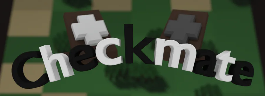
Above, you can see a cool “before” image, right under the introduction. To me, it already looked good, but I felt like there still were some improvements to be made. I decided to look into adding an additional light point & making some contrast changes.
Instead of boring you with walls of text, let’s just jump to the final result:

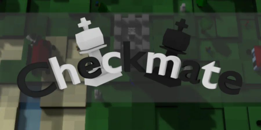
Now, there’s not a whole lot different, but there should be two major changes: The floor and the water. I’ve played a bit with the colours of these elements and the difference was already quite big.
In this new setup, the water really pops and adds to the colour of the board. The darkness of the floor also provides much better contrast with the board, drawing your attention to it much more. I’ve also made some subtle lighting changes; If you look closely, you’ll be able to spot the difference. Although tiny, it does make a significant improvement.
The only thing I’m missing is rim lighting, but I’m still struggling getting the shader for that to work. I’ll toy a bit more with that soon enough, however.
Main menu & options
Besides the graphics, I’ve made a start on the menues, as seen below.

I wanted to keep it simple to stay within the theme, which is quite the succes. It still needs a few more features; The options menu has to be expanded and the “New game” option will have to be replaced by Singleplayer and Multiplayer counterparts, however, for a demo, there’s nothing wrong with the current setup.
I’ll be adding options like Fullscreen and VSync aswell, especially since these are very important.
As for the graphics options, the only thing you could do to speed up the game (with significant impact) would be to disable the shadows, however, this makes the game extremely ugly. Almost all machines should be able to run the game without any issues (my integrated graphics card on my 6 year old laptop runs this at 50 fps!), so I’m leaving those options out (for now).
Conclusion
As I said, it’s not a very productive week, mainly because the shader updates took quite a bit of time. I’ll be working on them a bit more next week, but after that, I should be back to adding new, cool features!
Have a great day and I’ll catch y’all later!


0 comments