Comments (39)
I am loving this game the game is amazing can't wait for multiplayer XD
Wow, awesome changes! But yikes, I went through the first tutorial again and after moving some pieces around at the end, and then pressing Enter to exit, I got: http://imgur.com/a/8LPx4
I can't seem to find the graphics processor part: http://imgur.com/a/X4fb8
Anyway, this is a very cool game. I would love a free-rotating camera!
I find that the GUI needs the most work to make playing the game less tedious:
In the tutorial, the text-advancing arrow keys hinder the experience, because you have to be at a certain zoom level and also be able to see the right side of the board to advance. It would be better to be able to advance by pressing Enter and/or the arrow keys to progress. It also shouldn't immediately move to the next tutorial text line if you press early, but should finish the text if it was still rolling out (Some of us read fast and want the tut text to display instantly.)
At the end of the tutorial, there is no warning given that the last click of the right arrow ends the tutorial. It should say "Clicking the right arrow will end this tutorial," or the arrow keys should disappear completely, letting the player use Esc to leave. I accidentally exited when I wanted to do the practice that it suggested.
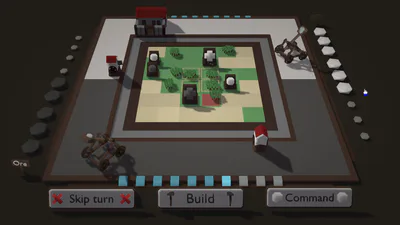
The unit that you just moved shouldn't deselect simply because you gave it a place to move to, especially if you accidentally click on a location across the map that's too far for it to queue moves to (because then you have to bring your mouse back to that unit to re-select it and give it a more fitting move order).
Checkmate severely suffers from how tedious it is to select and move units, because you can't drag a box and have to click exactly on one unit at a time to select it (which can be pain if you're zoomed out for a tactical view, or if you're zoomed in but in the wrong area of the screen). Numbering units 1-9 would be very helpful (like in Red Alert or Total Annihilation when you can press Ctrl+# to assign a selected unit a number.) When zooming out, Supreme Commander-/Planetary Annihilation-style icons for easier selection of individual units on the map would be very helpful. And/Or maybe there could be a column of little icons on the left side representing each of your available pieces, which you could click to more easily select one, and double-click to also center the screen to it.
Panning through the research menu can feel heavy and time-consuming. If the build screen was made to dynamically follow the mouse's screen location (so that mousing to the bottom-right of the screen would show the bottom-right of the research hierarchy) instead of needing WASD to browse through everything, that would be awesome.
Double the scrolling speed if you use WASD and also put your mouse at the edge of the same key-pressed screen(s) at the same time.
There is no alert for the location of the enemy you discover. I sent out many pawns exploring the map at once, and when hybrid suddenly went from real-time to turn-based mode, I had no idea of where the encountered black piece was and had to look carefully. It would be very helpful if there was a minimap and/or the ability to repeatedly press a key to cycle through all visible enemies on the screen, or at least of the ones that moved in the last turn.
All in all, from what little I've played so far, I think this is a fascinating game that could benefit tremendously from a more sophisticated user interface that helps the player handle the basics of command more easily.
Please Help
Crash Report:
############################################################################################
FATAL ERROR in Fragment Shader compilation
ShaderName: sh_diffuse
C:\Users\Anderson\AppData\Local\game-jolt-client\Games\checkmate-178465\default-266292\memory(11,21): error X4502: invalid ps_2_0 input semantic 'NORMAL'
############################################################################################
called from - gml_Object_menuObj_Draw_0 (line 17)
NVM. I must have quit while it was saving or something. It worked fine now.
Free
Legacy build
The old version of Checkmate before it became simplified. It is highly discouraged to download this version, as it solely exists for documentation purposes.
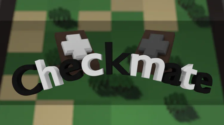
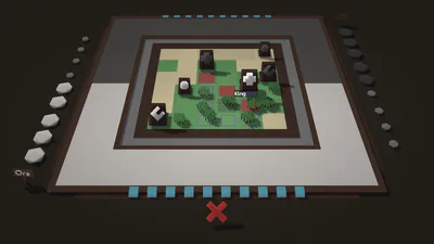
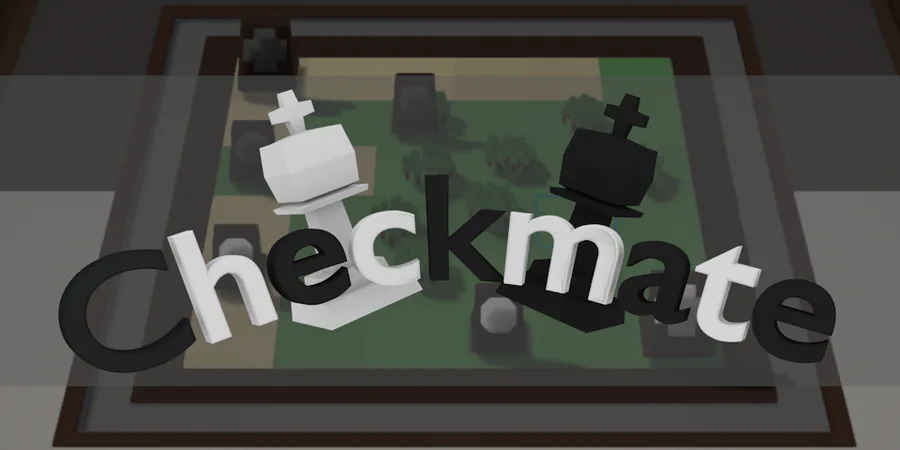
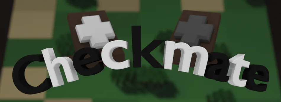
"Checkmate" is a hybrid between Chess and the management game genre. By combining a management element with the strategy part of Chess, this game creates an unique experience for all ages.
Checkmate plays out similarly to Chess, however, you gain the ability to create buildings on the sides of the board. These buildings are used to attack enemy pieces or to spawn new ones and can have serious impact on strategy and board gameplay.
Starting out with a randomly generated board, the experience will always be fresh. Anything can happen and there are no "winning strategies"; Instead, you will have to use your brain in order to win from the computer and your friends online...
The game features various different options of play, including:
Classic Mode: Play the game as it was meant to be played.
Sandbox Mode: Toy around with unlimited resources and see what horrors you can create.
Scenarios: Test your knowledge and skill on a series of pre-made scenarios ranging from very easy to incredibly difficult.
Each mode is customizable with a wide set of options to choose from. Ban pieces or buildings that you don't like playing with from the board, choose the theme of the environment, and more.
But what if you cannot play Chess (/ are bad at it)?
Don't worry! Checkmate may have similarities with Chess, however, its unique building mechanic forces different ways of thinking, making conventional Chess tactics no longer valid. This creates equality between those who are experienced or unexperienced with Chess.
The game also includes several detailed tutorials, which will take you through the entire basics of the game and will hold your hand in the learning process.
This game is currently in development by a 1-man team (namely me). The idea originated from Sid Meier's Civilization V, which I always used to play. I really liked the game, but I didn't like the battles, which felt really flat and seemed like they required almost no skill at all.
Have a great day!
~Gavin
#strategy

