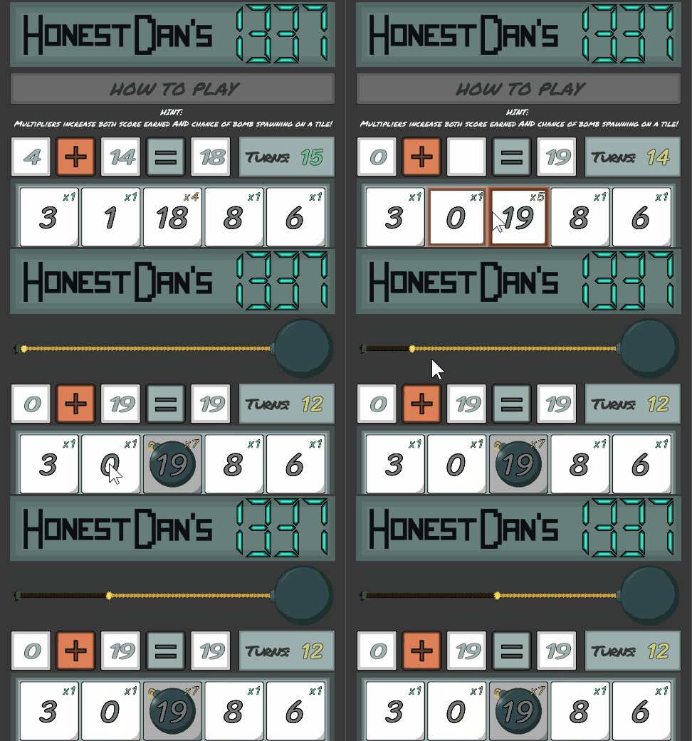
First off, I wanted to improve the bomb timer. The image quality wasn’t great, it looked a bit odd, and it wasn’t clear or obvious enough to a new user. I tried creating an animation for a winding bomb fuse burning down, but realised that I’d need to animate about 600 frames if I wanted it to look smooth. Instead, I decided to try and use a slider creatively, and created a new straight rope sprite. I set a blackened version of the rope to be the slider fill, and then the normal rope as the background, and a “spark” animation as the slider handle. The allowed me to control the slider fill based on the bomb timer, which gave the effect of the bomb fuse burning down. It isn’t super pretty, but I really am happy with it.
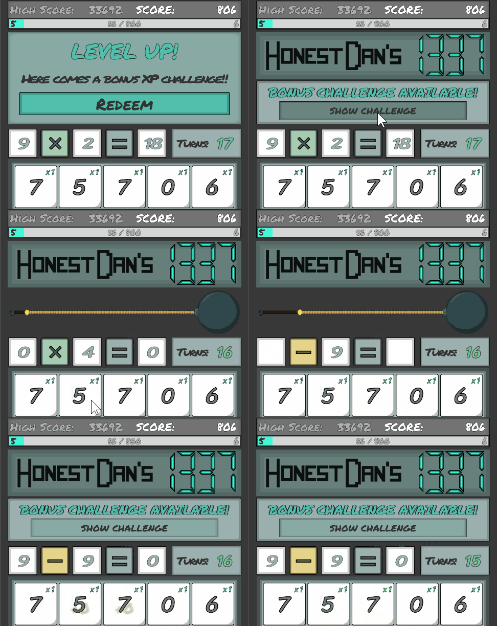
Another thing to work on was making the “Bonus XP Challenge” be less intrusive, and allow players to feel it’s okay not to complete the challenge. Previously, if people were unable to compelte the challenge, it would make them feel like they are stuck. Instead, I wanted them to feel like bonuses. The core display still functions as it did, but now you can minimise them, and also they are automatically minimised if the bomb defusal panel is displayed and defused. It can be opened with ease, and this way makes it less intrusive of a feature.
More changes incoming, in the next devlog!





0 comments