
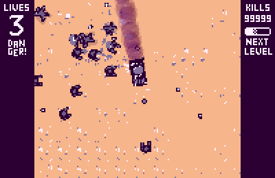
The upgrade card art is still a work in progress, and I'm not totally satisfied with it yet. It looks too... solid, right now.
The upgrade icons are placeholders I got from this pack here, from Open Game Art. I'm using them to test where things will go and how they will look. I also think that the card text is still too small, but maybe this is aggravated by how cards 1 and 3 are crooked, making the text harder to read. I'll keep doing some tests in this regard.
Now, for the next steps, I'll code some of the powers and see how the game progresses from them. In this kind of game, powers and upgrades design is what matters the most, and the rest of the game will eventually grow from it and around it.
As soon as I have new powers working, I'll share them with you all here!
So long, suckers!


6 comments