Huh.
You guys sure about that?
Uhh… alright then, I guess.
Anyway, this week’s progress has unfortunately been rather minimal. Not only were certain current world events pretty disruptive for me for a few days but almost the entirety of last week was taken up by unexpected work obligations which all left me pretty exhausted. Even writing this blog post has taken longer than it was supposed to, hence why it’s coming out late once again for which I apologize. On a more positive note though, I’m back to working on sprites and animations. It’s a bit of a rough experience returning to that after the extended break I’ve had but with my work schedule clearing up this week I should hopefully be back in the swing of things eventually. I’ve been holding off on buying Aseprite still, it seems neat but I don’t know if I have the time and energy to learn yet another software with all my current obligations (one of which being learning ANOTHER software (Photoshop)). FireAlpaca is limiting as always and this particular animation I’ve been working on of Vanny going up a set of stairs is not only more complicated than usual but also involves her actually interacting with her surroundings. I’ll try to spend the next 2 weeks seeing if I can continue to work around the limitations of FA’s animation mode and if things don’t ease up from there I’ll probably just give Aseprite a go. In the worst case scenario it’s just going to be a slight upgrade to my current setup and by this point I’d be happy to get even that.
Speaking of animation, now is as good a time as any to talk a bit about the visuals in my game. There’s multiple different aspects of this topic which I plan to discuss separately over the next couple of dev diary entries but for now let’s start with the more general elements.
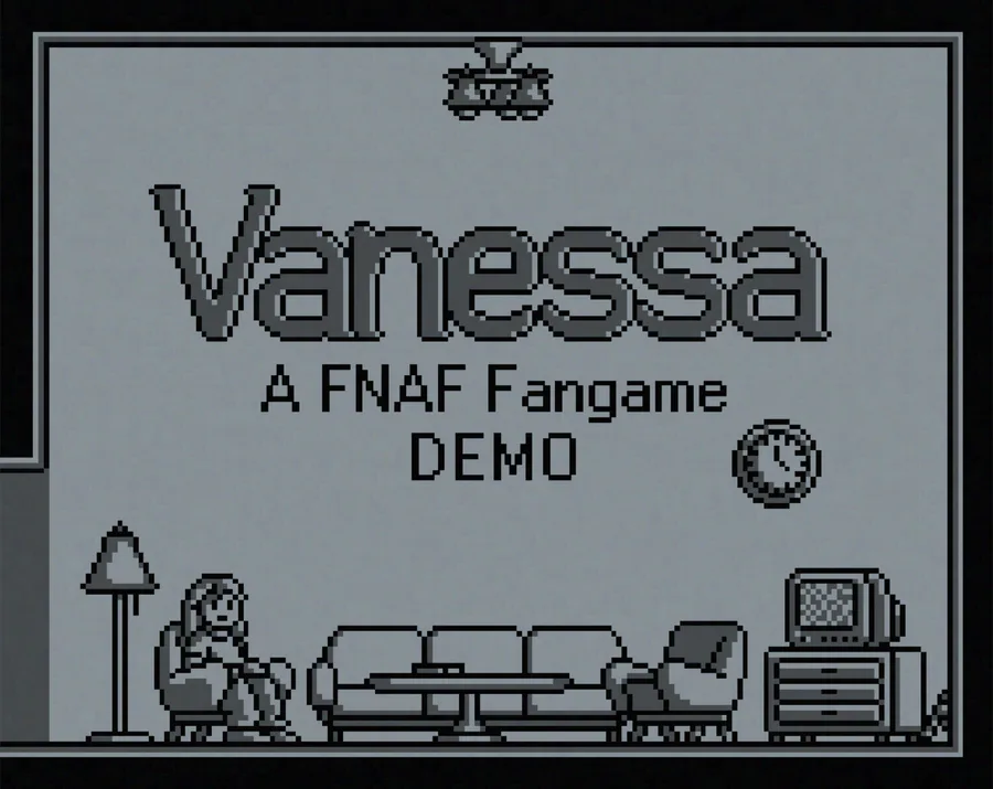
As previously mentioned, “Vanessa” is inspired a lot by Lylly’s “Super Five Nights at Freddy’s”, a 2016 sidescroller adventure game inspired by the first 3-4 FNAF games. A lot of those inspirations I’d say are actually more of a reaction to things that game was doing that I figured could have been done more tastefully but the visual identity of the game is one aspect of it that I enjoy completely(for the most part). Horror games from a 2D sidescroller perspective in general is something of an unexplored niche in my opinion. The dimensional limitation actually gives developers a lot of opportunities to frame important parts of their games in ways that are visually interesting or enhance the mood of the narrative in some way. Besides SFNAF, other inspirations for the look of my game are Matt Gilgenbach’s “Neverending Nightmares” and especially Jasper Byrne’s “Lone Survivor”. The art in my game is a combination of the monochrome look of the former and the boxy pixel art of the latter. Coincidentally those are also the easiest elements to replicate from each of those two games.
In a way the biggest inspiration I have for the game’s artstyle is probably my own limitations as an artist – I have been drawing and making pixel art for at least 7-8 years now and while my artstyle in both mediums is now at a level I’m quite happy with, my speed has always been pretty lacking. And that’s not to mention my lack of experience with 3D visuals, which ensured pretty immediately that the game is going to be in a 2D perspective. Even though “Vanessa” started out as a somewhat small-scale project, I always knew that a videogame of that type is going to require a lot of art assets so the decision to render the game in monochrome pixel art was made pretty early on. Pixel art sprites are not only pretty easy to make compared to hand-drawn ones, they’re easier to make fit together in one environment and can be edited on the fly if the scene needs to be rearranged. The black and grey look makes things even more straightforward as now I don’t have to worry about colours being off and not jelling together into a cohesive palette.
Of course, this is looking at things from a pretty coldly pragmatic perspective. I do think there’s merit to the visual style outside of the ease and convenience it gives me in making assets. Obviously the monochrome visuals enhance the dour mood I’m trying to achieve, but there’s other smaller details that add their own flair. One of the themes of the game is Vanny’s feelings of detachment and separation from the world around her and that includes a separation from the audience as well. The player is not Vanny, Vanny is a separate individual who ultimately remains somewhat unknowable to the player even as they delve into her inner world. The perspective of the “camera” is such that Vanny is always at a distance from the player, always being shown in a wide shot. I actually briefly considered adding brief cutscene slides from Vanny’s point of view during more important moments of gameplay - for example, her finding a note would cut to a still image of her hand holding up the note before cutting back to regular gameplay. Ultimately I didn’t go for it, partly for practical reasons (making those slides would be extra work and the monochrome pixel art isn’t as suited for them) but partly because cutting to Vanny’s perspective like that does break up the separation the game was otherwise building up. Cutting away from that continuous wide shot – even it’s just cutting to another wide shot – should be done first and foremost to further enhance the mood, not just to give clearer expository information.
The pixel art aesthetic too has a subtle function of its own. Pixel art in a way requires the reduction of the object it depicts down to its most distinct elements, sometimes down to a silhouette. The loss of smaller details can introduce a sense of vagueness which itself can add to the mood. There is an emotional uncertainty that the 35-40 pixels rendering Vanny’s face evoke throughout the runtime of the game as the player is not allowed to ever really know for sure how she feels at any given point.
Usually pixel art is used in modern games as a deliberate throwback to an older era of gaming. FNAF itself uses graphics reminiscent of the Atari 2600 for its minigame interludes to convey its narrative through an era-appropriate visual aesthetic that the ghost of a murdered child might process its trauma through. Of course, adherence to the actual real-world tech limitations of the time is usually a secondary concern at best – SFNAF casually throws in gradients and perfectly smooth diffuse lighting on top of its pixel art, “Lone Survivor” gets fancy with ambient filters and chromatic aberration and even FNAF itself quickly begins to disregard the actual capabilities of the Atari 2600 as its blocky pixels turn at unnatural angles or smoothly fade away. Of these examples “Lone Survivor” is the most interesting to me as unlike the other two games it doesn’t try to evoke any specific era of gaming with its pixel art and the aesthetic is instead specifically used to introduce the sort of emotional distance and melancholy which I wish to emulate. The game even goes one step further and covers up most of the player character’s face with a medical mask to further make their emotional state more uncertain to the player, though that does come with the slight downside of making him look a bit like he has a huge grin on his face the whole time.
With that all addressed, I can finally talk about the monochrome look of the game and its function beyond just being a time saving measure. Obviously my game also doesn’t really try to emulate any specific console generation or era of gaming. Even though there have been games that were rendered in monochrome pixel art due to technological limitations, those were usually done in a 1bit style where a pixel is either on or off. That’s actually how my game started out as well with a pure black and white pixel pallete but eventually I introduced a third colour (and darker shade of grey) to use for shading and adding details to objects. Later on I also changed the white to a light grey to reduce eye strain. Finally, some filters on top of all that give the game a slightly colder and more grainy look, though they can be turned off in the options. This all comes together to create the world in which Vanny sees herself living in, one which she would say is made up of shades of grey and black even if she doesn’t actually think there are all that many shades in it. There has been media that has used a black and white visual aesthetic but has also featured one or more coloured elements for thematic or visual emphasis (for example movies like Schindler's List or Sin City and games like the aforementioned Neverending Nightmares or Hatred). It’s tempting to do something similar in my game but that sort of very overt subversion feels a bit cliché to me nowadays if it doesn’t serve some deeper purpose and by this point there’s no place to add it in as I’ve already got a pretty complete vision of the game in my head that works perfectly well without it. I’ll probably get more in detail regarding this in another dev diary but subversion for subversion’s sake is a bit of a turn-off for me, especially when it comes to meta elements in storytelling. This is obviously not that but it still calls attention to itself in a way that I feel detracts from the game’s narrative and mood. Either the use of other colours will happen early on in the game, which would require it to not be all that narratively important or it will happen later on when the player is more invested, by which point doing things that might remind him that he’s ultimately just playing a game would be a bit ill-advised. Plus, I like black and white. They’re generally pigeonholed into a select few aesthetics and moods nowadays but they’re flexible enough to have handled photography and film for many decades before colour was introduced in both mediums. The movies of Charlie Chaplin and the Marx brothers are still funny, Edward Weston’s photography is still beautiful through form and shape alone, etc. Even if my game doesn’t reach those specific artistic heights or ambitions, I do still like a good old straightforward execution of the style. Though of course I would also like to believe there will be a little more to my game than just that.
I have more to say on my game’s visuals(in particular the user interface and possibly also on animations specifically) but I’ll pause for now. I feel like this entry was somewhat rambly and not very coherent anyway, probably as a result of me rushing it a bit since it’s already so late. Adhering to self-imposed deadlines isn’t exactly my strong suit, I do better with regular ones instead when there’s actual consequences to going past them. I will actually try to write my next dev diary entry on time though and I’m looking forward to hopefully doing some progress on the animations if nothing else.
Thank you for reading this far, if you have any questions or comments I’m always happy see them and respond.




0 comments