Welp, so much for getting this devlog entry out on time.
I apologize for the pretty severe delay. When I first started writing these blogs my intention was to have one published every two weeks during the weekend. It’s been a little over 2 months since I’ve started the dev diary though and I’m already lagging behind by a whole week. In this specific case I don’t really have any reasonable justification for it either, it’s really just an unfortunate combination of sleep deprivation, procrastination and a badly timed resurgence in my interest in Yu-Gi-Oh. Speaking more broadly though, I really need to take more seriously the fact that it’s not just the game that will require effort and dedication on my part to develop in a timely fashion, but also the writing of this whole development blog as well. It might not seem like much but writing up to a thousand words every two weeks doesn’t just happen at the snap of my fingers. I will try to get back on schedule with that in consideration, I’m thinking I could probably even start working on the design philosophy portions of each entry in advance before doing the bi-weekly progress round-up.
Speaking of which, I do have good news regarding progress. The issue I ran into last month of having difficulties with making more complicated spite animations in FireAlpaca has been resolved and all the stair animations have been completed (going up or down while facing both left and right). In fact, I might even put in some extra effort for making alternate animations as well, for example animations of Vanny going up or down stairs with railings where she actually uses the railings. This might be getting into feature creep territories but I’m not too worried about that at the moment. Static sprites and animations are the easiest part of the game for me to work on as it’s fairly mindless work which I can do in the background while I have a video or a podcast playing on another screen. As such, it’s ideal as something I can still work on even as I’m facing writer’s block or a particularly annoying programming issue. The biggest issue would probably end up being integrating some of those animations into the game in a way where they smoothly transition from one to the next, but that’s something I will have to work on even if I stuck to having the bare minimum of animations I need for the story to work. Moreover, once I do the scripting for one set of animations, copy-pasting that for another set (with some adjustments) shouldn’t be too hard.
With all that said, I’ll try to keep my game design thoughts brief this week and go over a few things I didn’t get around to mentioning in my last dev diary entry regarding the game’s artstyle. Back then I talked(or rather, rambled semi-incoherently) about the general aesthetic decisions of my game and the inspirations behind it. This time around I’ll get a bit more specific regarding my specific approach to bringing those ideas to fruition.
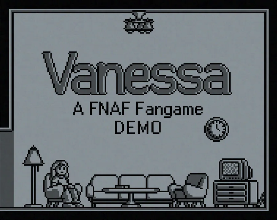
When it comes to both the process and the final result, my approach to making pixel art is somewhat similar to how I go about making regular digital art – I start with a rough shape/sketch which I use as a basis for a more refined outline(usually using pretty prominent black lines) before moving on to colours and shading. With pixel art specifically I start by “sketching out” the general shape of the object by making a black blob with a bigger brush(with anti-aliasing turned off) and sculpting it down until it matches the silhouette I have in mind. Once I have a shape I’m satisfied with, I hollow it out to get the outline of the sprite to which I then add any additional extremities that are inside of the object or are too small to draw in the first stage of “sketching” the sprite.
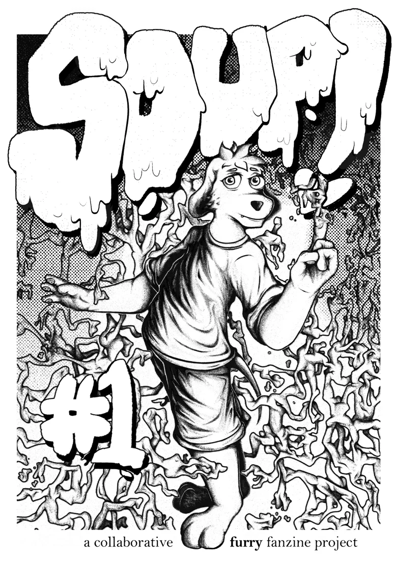
I’ve always favoured thick outlines, especially in digital art. I’m quite inspired by comicbook inking, but I believe one of my earliest inspirations for that and other artistic habits of mine was the cover art of the El Huervo album “Do Not Lay Waste To Homes…”. When it comes to pixel art I still use black outlines but keep them just 1 pixel thick. That’s because the sprites I draw are usually pretty miniature. For example, Vanny’s idle sprite in the game comfortably fits in a 20x40 pixel box. With sizes this small a lot of detail can get lost under the thicker outlines, especially in my game’s case where the colour palette is purposefully limited and there’s not much separation between the background and foreground. I compensate for the lack of thick outlines with the shading which I tend to draw more flat-looking without much dithering to transition between different colours (flat shading is what I tend to go for when making digital art as well). That combined with the boxy shapes of a lot of the objects in the game, the picture-in-picture way of presenting the game space and the purposeful flattening of the image are intended to make the player feel boxed in. The GUI design also plays a role in this, though I’ll talk more about it another time.
The sprites themselves have somewhat exaggerated proportions, particularly the human characters whose heads need to be big enough to have somewhat readable expressions. That’s mainly to communicate to the player at a glance what the things they’re looking at are supposed to be – seeing a clearly defined face lets the player know that they are in fact looking at a human. Of course, as mentioned previously the face sprites are still too small to convey different emotions very well. I’ve briefly considered having RPG Maker-esque character portraits with different emotions to express different emotions but decided pretty quickly against it. Besides the previously stated reasons of looking to achieve emotional distance between the characters and the player, I’m perhaps somewhat worried that those sprites might distract the player from the animations that are currently happening on screen during dialogue. One of the game(s) that inspired my own game – Hotline Miami and its sequel – actually have that problem to a pretty severe extent. In Hotline Miami cutscenes up to half of the screen is takes up by a black dialogue box and floating wobbling character portraits on the side flapping their lips as the character talk. There’s so much visual stimulation going on that a lot of tiny little animations on the actual top-down game space screen go unnoticed – for example in the intro cutscene to the HM2 level “Final Cut” it’s very easy to miss martin Brown pulling out a hammer from his jacket pocket. It’ss a bit of a shame as there’s nice attention to detail to add that animation, the hammer even glittering for a moment as Martin gets up. I have more thoughts on my own animation process as well as the general staging and timing of animations in-engine but that’s best reserved for another time.
I’ll try to have the next dev diary entry done by next week as I’m already a week late with today’s dev diary entry. In the meantime besides working on sprites more, I’ll also try to get a few areas sketched out so I can start figuring out the exact puzzle and cutscene design. Most of next week should be relatively free for me so hopefully I can make up for the time I spent watching Yu-Gi-Oh anime duel breakdowns and YGOTAS.
Thank you for reading this far, if you have any questions or comments I’m always happy see them and respond.





0 comments