1 year ago

Logo evolution


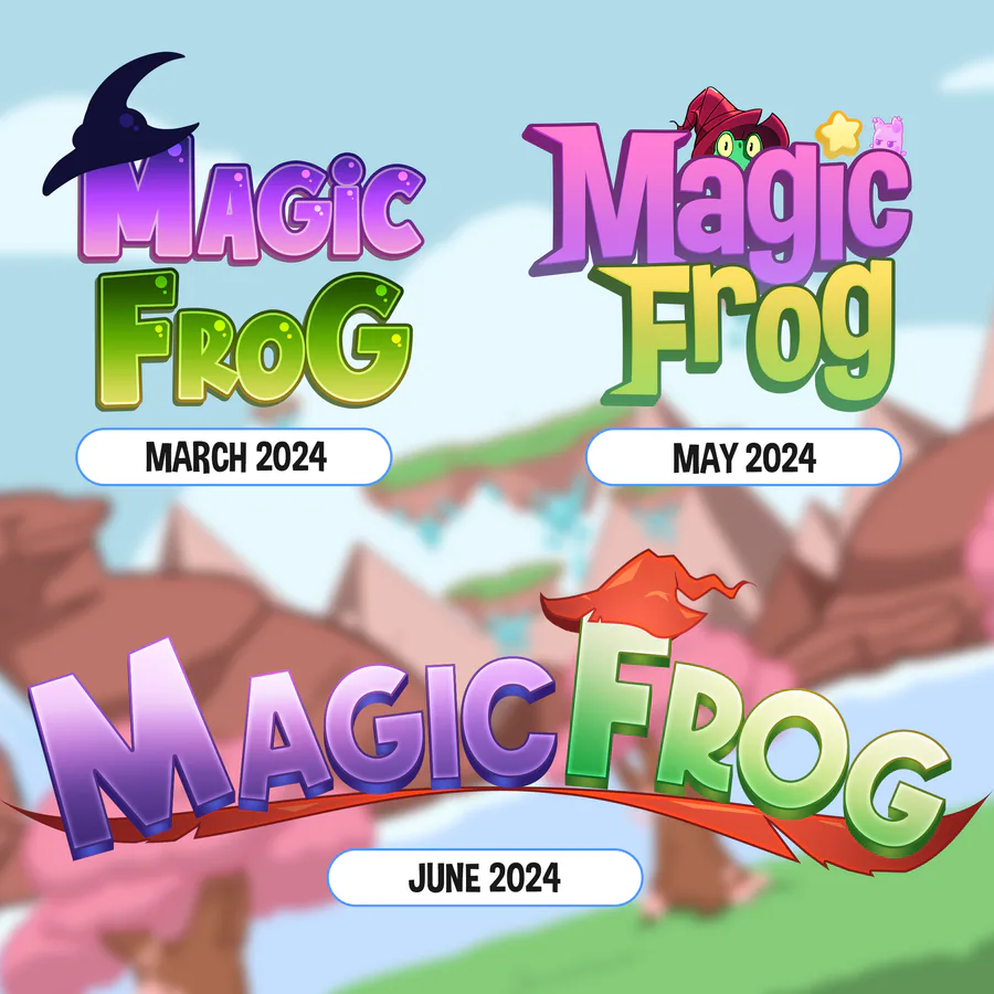
Finding a visual identity is challenging, but we believe we are on the way! ✨

At the beginning of development, Magic Frog had a look overflowing with cuteness. As the decisions were made, the look was improved to a more radical and rebellious version, saying goodbye to the excess pink and rounded edges.

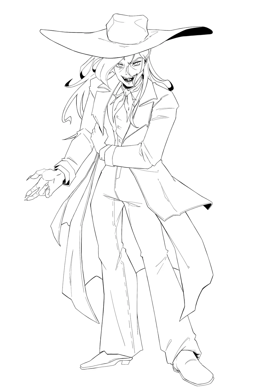
We also gave preference to the appearance of our protagonist Rhana: his hat positioned over the "Frog" and the torn cape beneath the text. 🐸

And there? Do you have a favorite logo? Comment for us! ❤️


2 comments

Loading...

Next up

They say a woman appears on deserted roads...

The O.D.V. is watching. From the shadows, they record every move, every secret, every lie. No one escapes the all-seeing eye.

Bahia is coming to life in Roadside Secrets

Goiás comes to life in Roadside Secrets!

A model inspired by the contrast between modern and historical, with lights and shapes that unveil the mystery of the cerrado.

which one hmmmm

shitty ahh book cover??

anyways ill be posting the speedpaint too

Even investigators need a quiet moment… or a strong cup of coffee.

Some secrets only surface when the night goes quiet

Haunted Gameleira — Concept Art

A tree consumed by restless spirits. Its roots hold tales of pain, vengeance, and resistance — echoes of shadows time could never erase.

Final line art! Here’s the concept for Lampião – The Shadow Loan Shark for Roadside Secrets. A dark, stylish take on a modern legend, brought to life with sharp details and attitude.