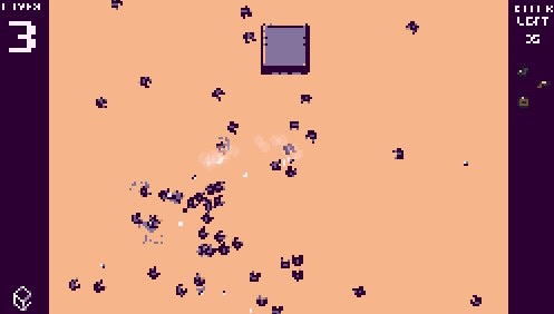
So... let's start at where I'm at now. This gif shows Dead Drift's current UI:
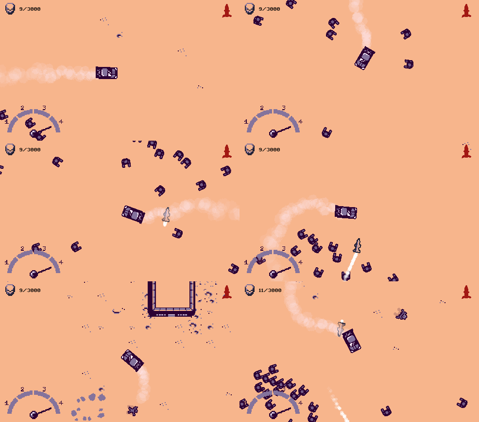
As you can see, there's a kill counter in the upper left corner, a speedometer-looking health bar in the bottom left, and a still-not-finished list of power-ups piling up on the upper right (that weird red rocket thing there).
This layout has some problems. Can you guess what they are?
The first one is that they use too much screen space. The Health Bar thing in particular (although it was truly fun drawing an animating it);
The second problem is that it uses too much space at the top and the bottom of the screen. Since the screen is wide, using these spaces make the screen look even wider... it makes the screen too "horizontal."
If we were to mark it in red, this is what it would look like:
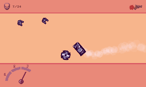
This feels weird, and it even affects gameplay: players will be rewarded by driving left or right because since the game's camera shows more of these spaces, the player can react better to threats that come from those ways.
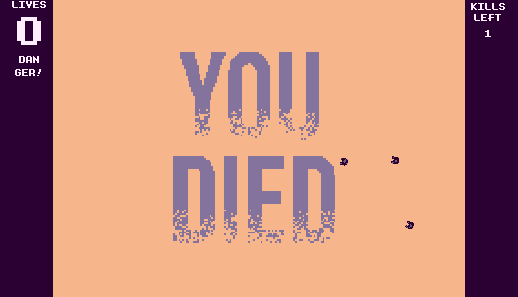
Thinking about this, I planned the following new UI for Dead Drift:
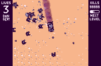
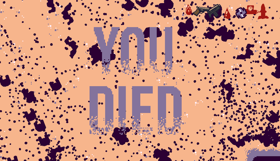
Don't worry about the pixelated thing in the middle -- this is just a project I drew on ASEprite, I only added something in the middle as a reference.
I think it looks pretty self-explanatory, but I will go into detail nonetheless:
On the upper left, we have a numeric health counter. Below it, there's a danger message which will appear when the player has only one life left;
On the upper right, there's a numeric kill counter, which increases with every zombie that's killed. Below it, there's a bar, filling up as you get closer to leveling up (and gaining a new power-up).
I immediately see two advantages of this UI project:
It uses the sides of the screen better. Now the game even has a squarer aspect, and certain directions will be less favored;
It has a more "retro" looking feel to it.
And about the things I lose:
The speedometer thing was cute, but I don't mind "killing my darlings" at all, as they say;
The power-ups list...
The power-ups list was something that I almost included below the "next level" bar. They would go down all the way to the bottom of the screen... but then I thought...
What about the mobile players?
This is not a hard restriction, but I'd like to have this game running on mobile (Construct deploys for mobile platforms, so why not?). The bottom right and left corners of the screen will definitely be covered by the players' thumbs, so... better not to use them.
I guess I'll put this information on the Level Up Screen, and on the Pause Screen. It's not critical to know this at every second anyway, and most survivor games do this.
So, that's it! That was a long one!
You'll likely see these changes on the next gifs I post about Dead Drift!
See ya all tomorrow!






























19 comments