

I forgot I had these saved and I'm glad I did. I can show you guys what the game was originally going to look, and what it's gonna look like now. I've improved so much in the past 14 months in making this game.

When the game was originally going to be 4:3. I found a image of the outside of a school (I'm hoping it's not AI). This also includes the old logo that I made as well. This actually wasn't finished when I recovered this so I edited it to what I think it was going to look like. I don't exactly remember what, so I just guessed. I'm not happy with the result, but it doesn't matter.

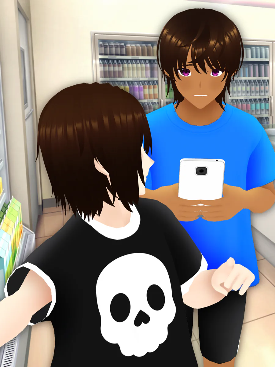
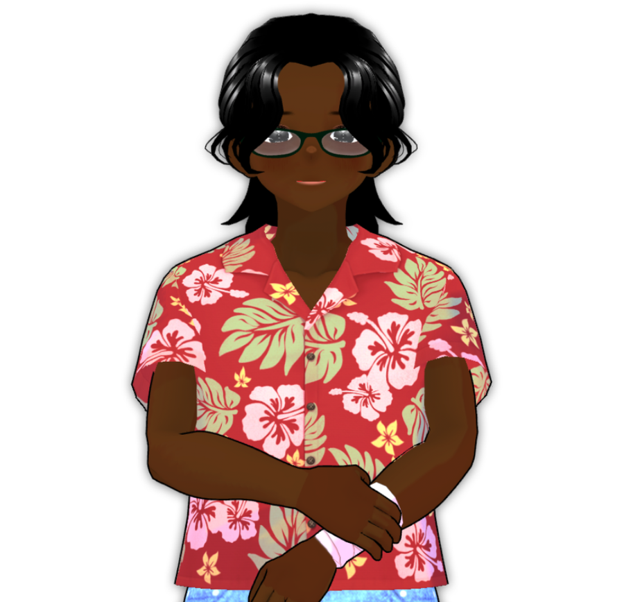
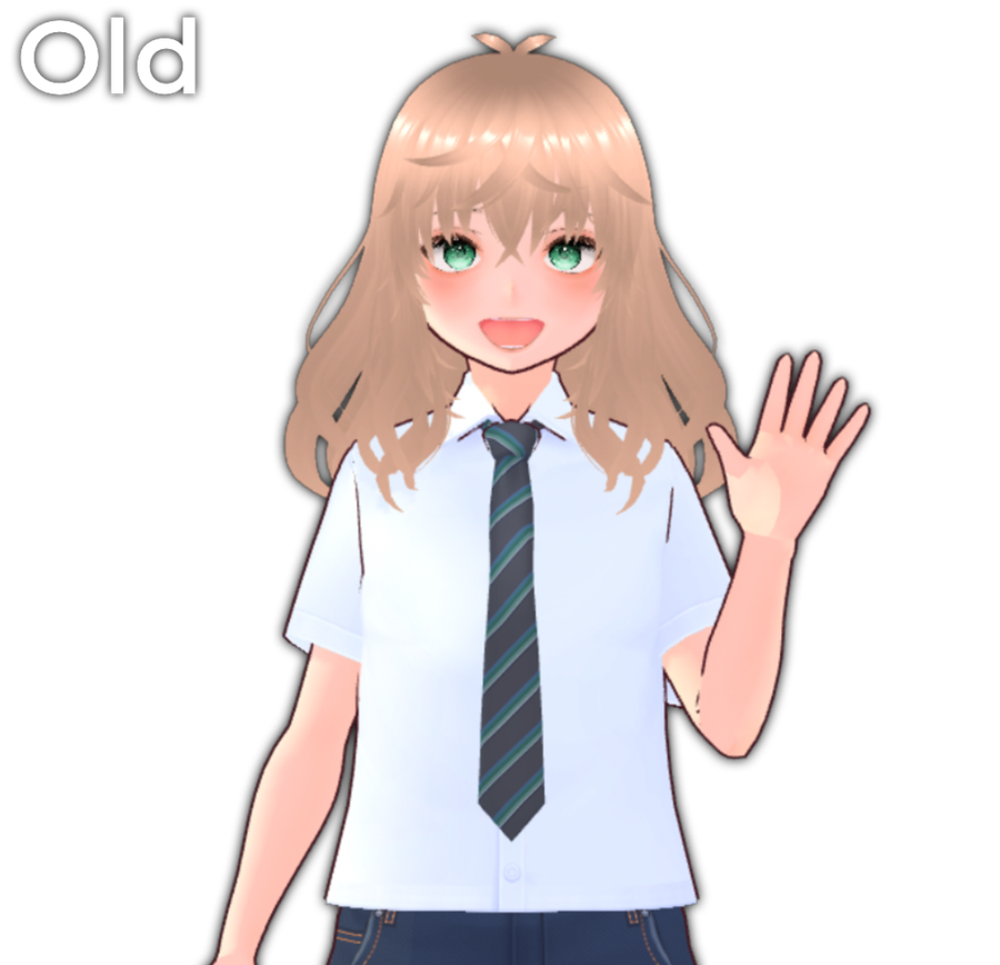
Same with this one. This time i decided the game was going to be 16:9, and I removed the image I found and replaced it with the characters. The background is the colors for the characters, for example the green at the top is Owari, and the low saturated red is Chase. Just like the last one, it wasn't finished when I recovered it so I edited it to what I think it was going to look like.

Many posts ago, I showed you guys the updated menu screen, and how I changed its style a few times. The first time I decided to change it to the one you're seeing right now, I was inspired by another developer who had the same concept. At that time, I had a logo change and a different color scheme as well. The background was supposed to be a black board because I still keep the school like vibe.

I decided that it needed an upgrade. The background is a black and yellow gradient with grey checkers, and the characters are a silhouette. The options look more advanced now, and the logo looks more geometric. I liked this one a whole lot better. Doesn't match the school vibe anymore, instead it looks more techy. Or not techy... Something like that.

I wanted to do one last change with the menu, and I think I'm sticking with this one. I dropped the checkered part entirely, and just kept the black and yellow gradient background. The characters are not silhouettes anymore. I think this was when I started to actually render the characters better. I'm proud of how much I improved the many years I became interested in art. The shocking thing about the first two, was that they were made 1 year ago.
Now that I've finally decided how the menu screen is going to look like, I'm gonna figure out how the DLC menu screen is gonna look, and the UI for that in general. But, I wanna focus on the main game first before I hop to other stuff.
Ignore tags #concept #dev #art #updates #wantingshock #gamergirlstudios


1 comment