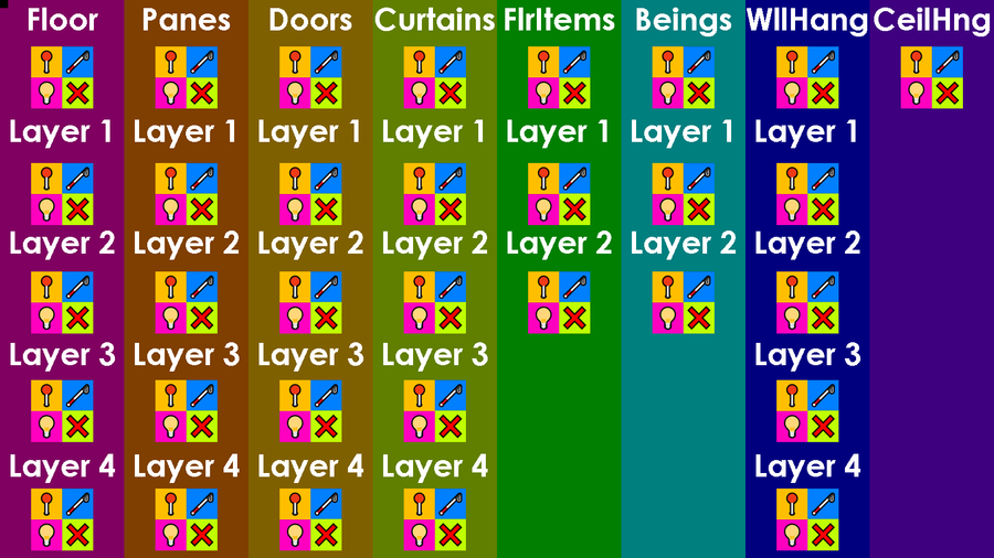
"What do all those pushpins and White Canes and lightbulbs and X's do?", you may ask:
The round pushpin turns on the indicator for said item, since there's no "Map-Pin"-emoji yet.
2. The White Cane, off by default, toggles the in-game screen-reader, but only for the respective item-category seen directly-above it. This will help blind players find their orientation and enable better independent mobility whilst navigating the interface, so as not to make things far-too-confusing for them. There, however, shall indeed be a "System-Voice" that will guide all players, including the blind, as they work with this tool!
3. The lightbulb icon shows the actual physical item class written above it. This is the button you would press to actually enable the furniture-editor for that specific object-group to appear.
4. The X box (See what I did there?) lets you hide the respective physical item-class denoted, DIRECTLY! Above it. Sorry, just had to pull a Nintendo®! Anyway, you would be correct in assuming that this X button would be useful when there are too many layers on-screen and you can't click-on the one you desire to edit.
5. The sets of icons at the top, below each item-category's name, are the "Master-Controls". They'll automatically toggle all one, two, or four; layers or channels; at once. Just keep in mind that any layers you've left on before toggling the master-setting will require a double-click on said individual channels before those elements will turn back on. Oh: and the ceiling only operates on one channel, so it's always either on, or off.
What do you think about the colour-palette of this menu's background? We wanted it to be darker to make the text as easy to read and the icons as easy to see as possible.
Please let us know your thoughts on the "Entity Expedition - Incredible Interior Inventor"-"Furniture-Placer"-menu, in the comments-section; thank you. As always, until our next post, "Happy Jading!™"








0 comments