


This is the old Startup and UI
Note:
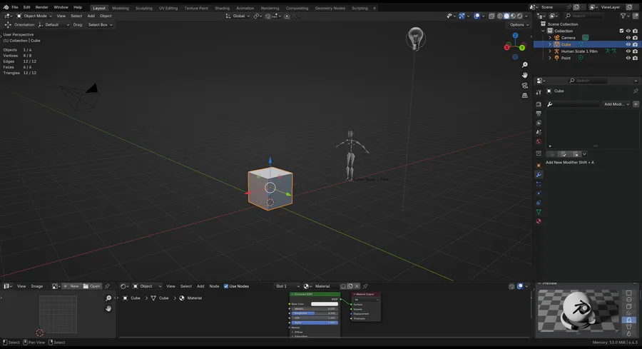
The Light 3D icons on the viewport will improve further and will have options to be disabled or enabled and an extra option to change the icon's style to a much more simpler look.
list of changes that you might not be able to see:
Reduced eye fatigue & Sharper text
Users can control the overall brightness and color of the Blender theme during First initial blender startup
Under preferences -> Themes are now much more easier to customize than before
Improved performance of Material preview [the one on the bottom right]
Improved Mesh visibility with default settings of an appropriate matcap for most scene cases and subtle cavity visibility
Improved visibility of high dense meshes in edit mode
Moving through Modifiers tab is now more efficient (W.I.P needs more work)
Cycles default settings have been changed to fit for better quality preview and slight performance
The New Light Icons can be disabled/enabled and there's two style modes: Simple... and bold (which is the one you saw in the footage)
Option to toggle ON/OFF 2.79's old icons.
Another important thing...
I'd also gladly want to gather everyone's feedback and what they want to see from a new blender UI overhaul for future updates of blender.
Currently this only applies to my game engine fork, but in the future when I do get the opportunity cause currently, the blender team is working and prioritizing on overhauling the animation pipeline, Vulkan, Video editor so on...
And I am helping to work on improving the animation pipeline as well with better performance..
But this is a lot of experimentation work and is subject to change. I am also taking everyone's feedback with not so full admission. cause this problem of making blender's UI/UX improved for beginners and so on, Is very subjective.
But this doesn't mean your feedback is useless, we still very much need these subjections. So that we make appropriate options under user preference settings


4 comments