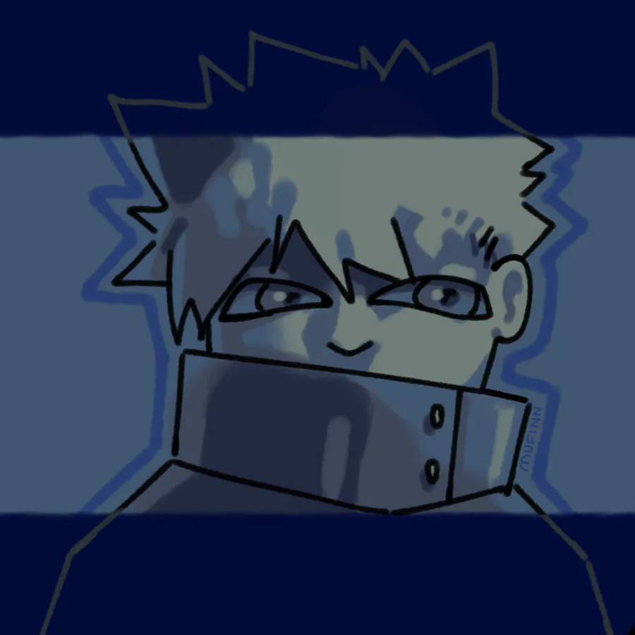
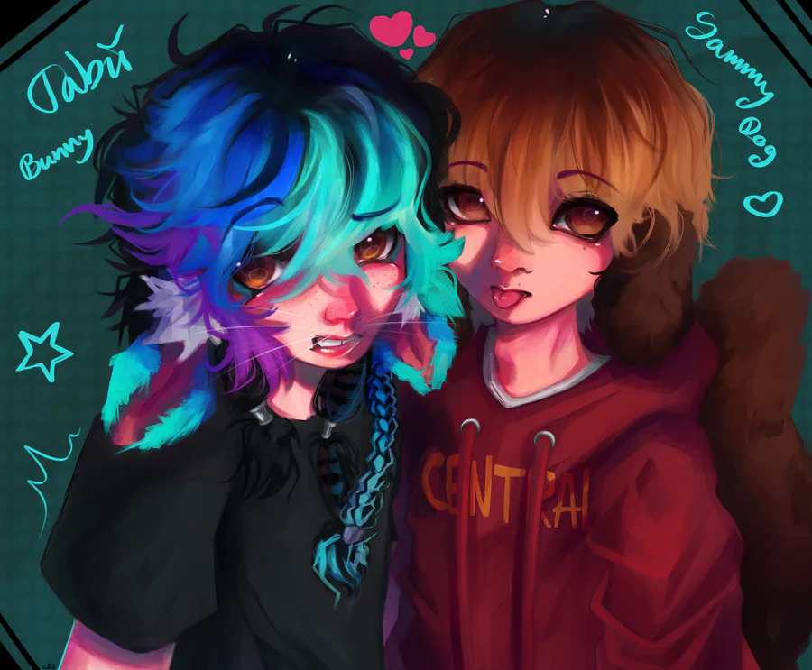
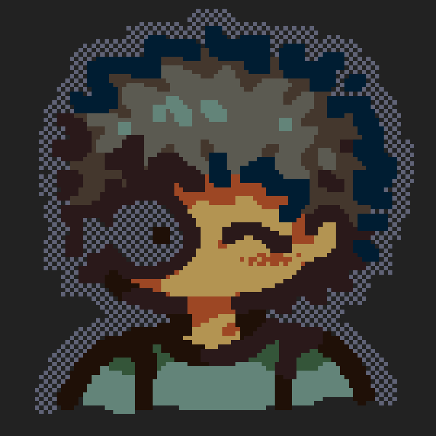
so basically color context, taking this example, is how if you have a painting that's fully blue and you use a very gray teal the teal looks way more like a yellow
you don't need to fully hue shift, in fact it'd look kind of bad, so like using grayer colors is actually really powerful for realistic lighting scenarios
i JUST learnt this tho and it's pretty flipping difficult to pull off but i definitely reccomend trying it if you draw
i also tried to (although didn't focus on) make a different facial structure because i have pretty bad same face syndrome on my drawings. so the eyes are a bit disproportional but this wasn't even meant to be a finished piece in the first place it was very experimental
#gjasks "what's your favourite multiplayer game?" minecraft is so fun on servers like i remember spending so many hours on hypixel skyblock (to be fair it was barely multiplayer since i played alone) or on the tommyinnit housing from the same server idk if anyone knows/remembers that







0 comments