You can no longer use the Arial font in your video games.
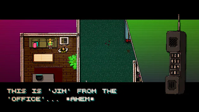
This is a screenshot from Hotline Miami. It’s a great game that feels great to play and to look at. The game feels this way because of how cohesive it is. The gritty look compliments the gritty gameplay. The art, gameplay, story, and music all fit well together. A cohesive game is what every developer should strive for! This level of cohesion is not easy by any means, but I do have a tip that can help.
Don’t use the default font ever again.
Would you release a game where your player character was a hand-drawn sketch but with enemy sprites that were pixel art and a background that was 3D? I hope not! It would be a complete mess. You don’t want this mishmash of art styles. You also wouldn’t want a game with incredibly wonderful player and enemy sprites but with a stark white default background.
Here is a Fact for you: Your chosen font is part of your game’s art.
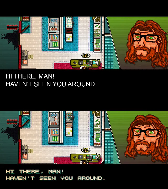
With that new Fact in your brain, go back to the previous paragraph. Having a font that clashes with the rest of your game’s art is just as bad as having the background art clash with the player art! Using the default font is just as bad as using the default background! You need to put thought into your font choice just like you put thought into your player sprite, into your game’s music, into every aspect of your game.
There are a lot of things in a game that people don’t notice unless it isn’t there. People often times don’t notice a good font, but will immediately notice a bad one, one that doesn’t fit the art style or that is hard to read. That is the main reason I feel like font choice is overlooked, it is not a necessity and it won’t make your game bad or great, it’s just a small piece of polish. However, I’ve played a ton of games on Game Jolt and Itch.io and I’ve learned to look for those small things. Those small pieces of polish add up. They make the game feel connected and whole, making something that is bigger than the sum of its parts.
Where do you go from here?
So now you know that Fact of font choice, but what now? How do you get a good font for your game? Well that comes down to your game and what you think looks good. A general rule I follow is that if your game is not pixel art then you will probably want an anti-aliased, non-pixely font. There are so many sites out there with hundreds of great fonts like that, Dafont is a good place to start.
For pixel art games you are often better off using pixel fonts. I’ve made a font that you can use for whatever you want and Fireside’s own Jupiter Hadley has made a bunch of really great pixely fonts. You can even make your own pixel fonts with FontStruct, which is how I made my font. A lot of game making programs have “sprite font” options which let you import an image of your font without needing a font file. It’s usually pretty easy and my favorite way of getting pixely fonts into my games.
I recommend getting a pretty good library of great fonts, both pixel and non-pixel styles, for game jamming. All the little polishing you can get on a game jam game really counts on making it stand out and having a big library can save you lots of time. I also recommend making your own font at least once! It’s super fun and relaxing.
So now you know to treat your font choice with respect and to not ever use Arial in your games ever again. Seriously. Even Comic Sans and Jokerman are better than Arial at this point.
I’m by no means an expert on the topic of fonts and everything I’ve said here has an exception to the rules, but nothing pains me more than to be playing a neat little game but to see horrid Arial font that just completely clashes with the rest of the game. It kicks me right out of the experience. I really want that to stop happening! Which is why I wanted to write this post and I hope it helps at least a little bit. Adding a good font in your game is an easy and quick way to add a bit of polish and cohesion!



42 comments