Heya, Rousseau here!  Ever wondered why your map looks too flat and dull, too cramped, too wide, or just not quite right? Well, it’s probably because you’re rushing to get your project done or it's just plain ass.
I will teach you how to transform your shoebox houses into something appealing because it's quite painful to see RPG maker devs to not at least try when it comes to map making. (Even though RTP is already a plentiful resource for them.)
So let's make a house...!
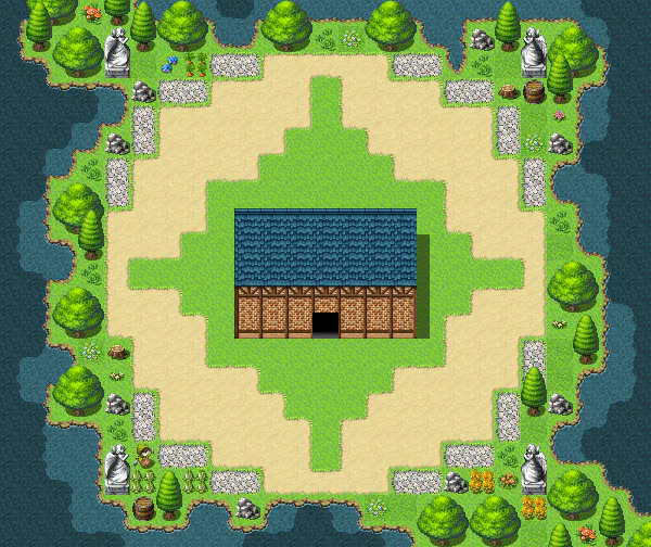
Seems quite decent enough yes? Many would just give themselves a pat on their backs by making a simple shoebox, but how about we take it up a notch?
Let's add a sense of depth, and a change of the roofing a little bit more...
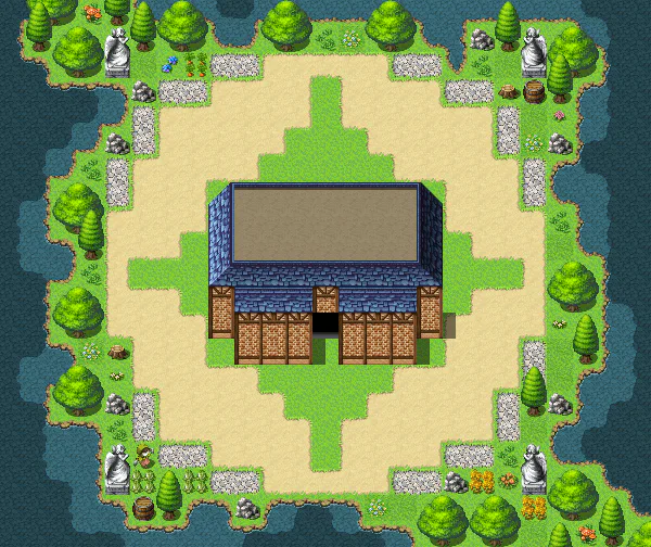
Now there's an improvement, yes? However, you may be asking-"Rousseau, it still looks like a shoebox..." It absolutely still does.
Oh well, let's fill up a lot more empty spaces then...
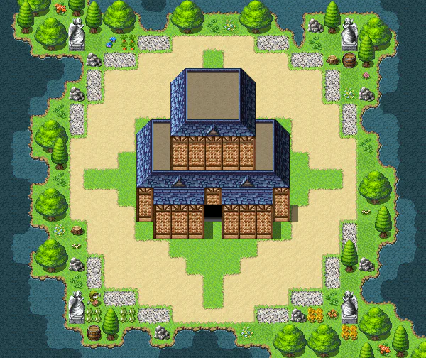
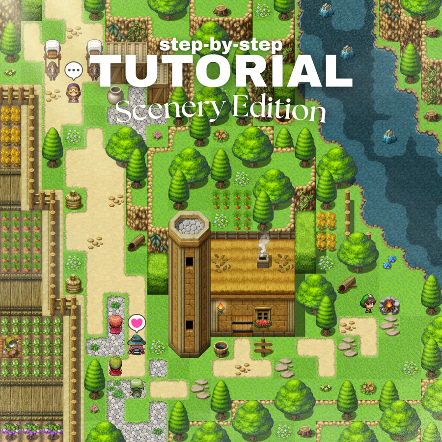
Well isn't that better? Many houses aren't just plain boxes, they come in a variety of shapes, this one looks as if it had its own history, now that's interesting to see.
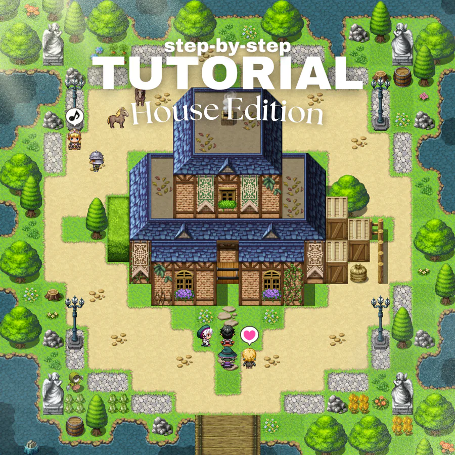
Now all we need to do is decorate it, add the necessary events, and of course, remember to decorate not just the house but also its surroundings...
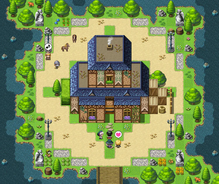
See how easy and fitting that is? Even the people like it there, makes it more lovely. I also think I'll make more tutorials like this cuz why not?
Hopefully this serves as a good tip, get creative! 





















10 comments