Game
Carnage in Space: Crucible


2 years ago

Unfortunately, I've hit a creative block writing story content.

So what's the best cure for creative block? Doing something else!

So here are some design concepts I'm playing with for an eventual sequel.

Design notes below \/


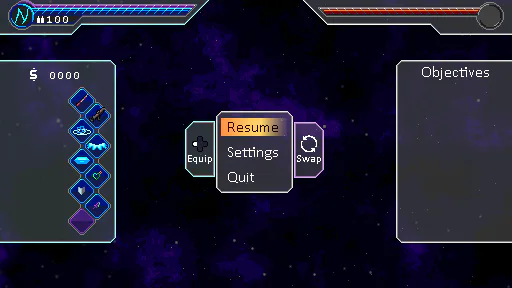
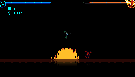
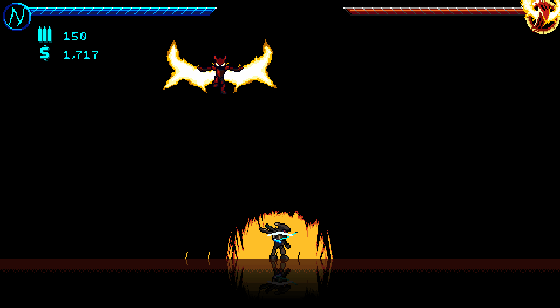
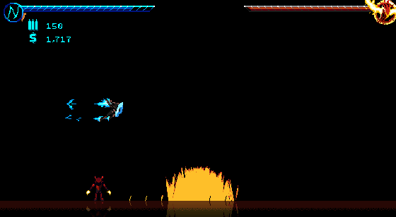
As you can see, this interface builds on the "digital gemstone" aesthetic that I came up with for Crucible. Unlike Crucible, this one swaps out the metallic gray backgrounds for clear, tinted glass ones.

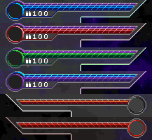
You might have seen a little of this in my Crucible screenshots, but each playable character has their own "highlight color" that the interface will match. Here, the glass will take on a tinted color to match the character it's associated with. This goes for interface panels, the message box, etc. You'll notice the inventory pane on the left side of the screenshot is tinted Nightmare cyan here!

Another touch I just came up with is the new menu cursor - this one is a glowing, animated background that goes behind the text. It's another thing that I hope will add more personality to the (future) game, and I intend to incorporate that dithered transparency gradient for other things, like character portraits.

I also want to make the geometry stand out to make the entire UI more memorable. This is just a rough draft, but you can see the backgrounds at the top corners are molded to the health bars. I intend to do more of that on the left, center, and right panes as well.

You may also notice some other details in this mockup, like that "Swap" button. I wonder what that does?


5 comments

Loading...

Next up

Oodles of options!

Accessibility aids aplenty!

I added some more settings lately to toggle distorted graphics, fine-tune the audio mixing, and other stuff. Hopefully this should make the game accessible to more kinds of players.

Wait, there's MORE???

...

Oh yeah, there's more. Once you annoy Crimson enough, he starts busting out the specials. This one, Flechette Storm, is just one of those screen-engulfing special moves you'll have to contend with!

But even that isn't the end...

Some new background elements in Chapter 4 (N). The sky's a little less barren now that there are more floating rocks off in the background.

These also use 3D depth for accurate scaling, parallax scrolling, and distance fog.

This week's Fan Art Friday celebrates Yooka-Replaylee! Accept the quest in your quest log to get started.

HEEEEEE'S BAAAAAAAAAAAACK!!!!!!!!!!!!!!!!!

For those who don't know him, this is Crimson. Nightmare's darker side. The most powerful being in the setting.

If you want to fight him, you're going to have a very, very bad time.

Happy #WIPWednesday! Are you working on a game? Making some art? Practicing a song? Something else? Tell us in the comments!

Presented without comment.

I've been retouching several things in the game that could use a little more love before release.

Among these is the nanotech system! You now get a flashy popup (with confetti and everything) when you unlock one, and the icons are also resigned.

Happy #WIPWednesday! Are you working on a game? Making some art? Practicing a song? Something else? Tell us in the comments!

I updated the character select screen again!

I ditched the blurred overlay background for a stylish color-changing gradient, and added a spotlight to justify the players' shadows.

I also combined player & difficulty onto 1 screen for efficiency.