Next up
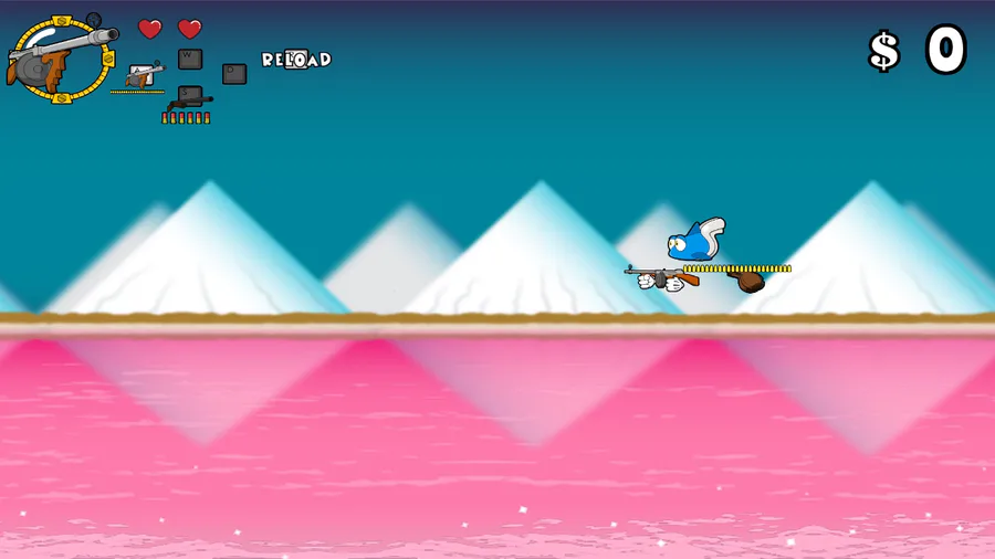
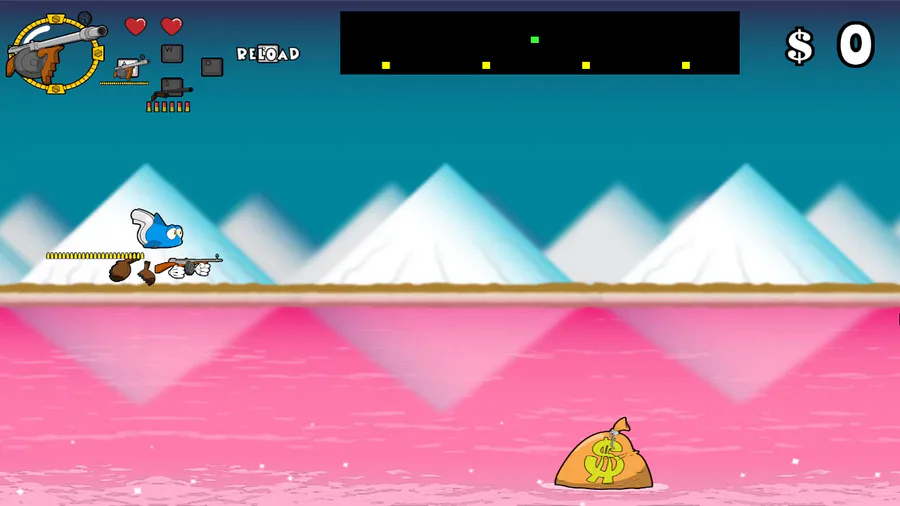
I'm currently working on a level in the same vain as Defender or Fantasy Zone. It took a while, but I was finally able to get the controls and basic fundamentals working. Let me know what you think.
新年快樂 Happy Lunar New Year!
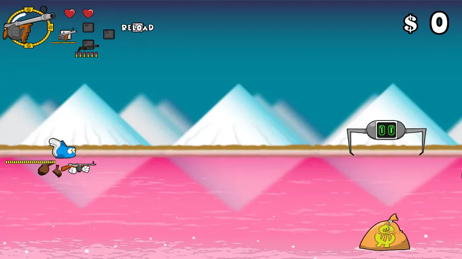
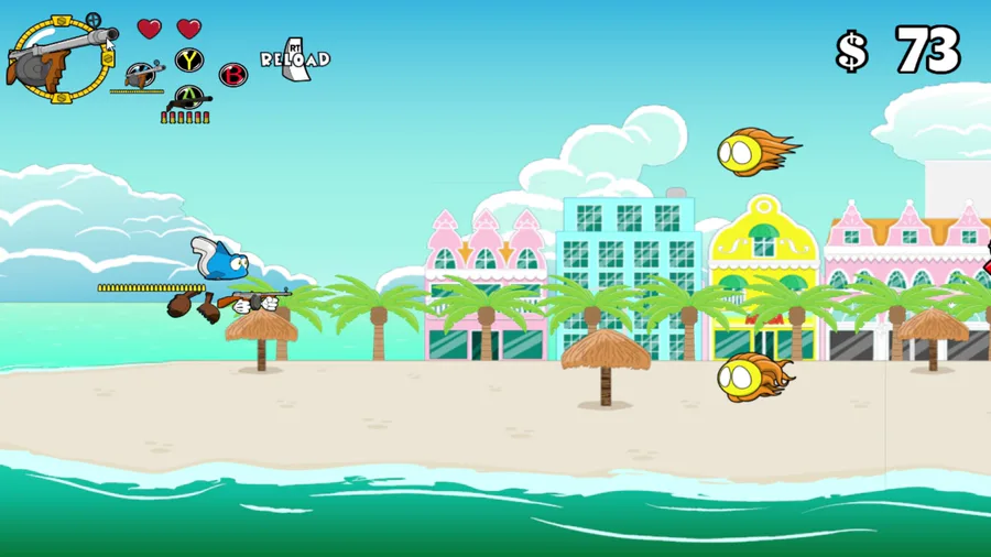
I finished working on some mechanics and animations for Tropi's Defender level set in Bonaire. Let me know what you think.
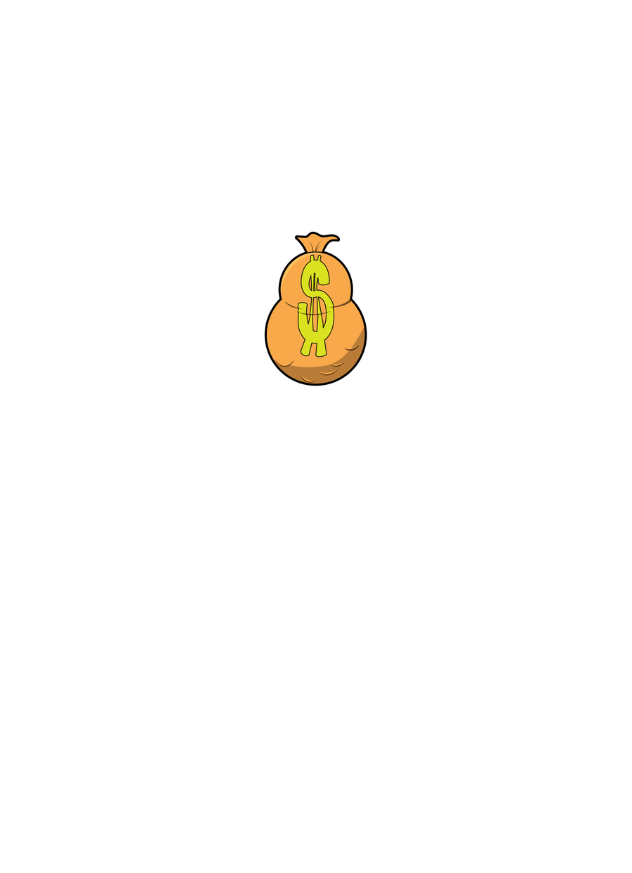
Updated a money bag explosion animation. Thoughts?
It's been a while since I posted something here, but I finally implemented gamepad support in Tropi with full analog movement.
Reposting this video on the game's main page, which is something that I intended, but forgot to do. This is the Defender-inspired level I've been working on.
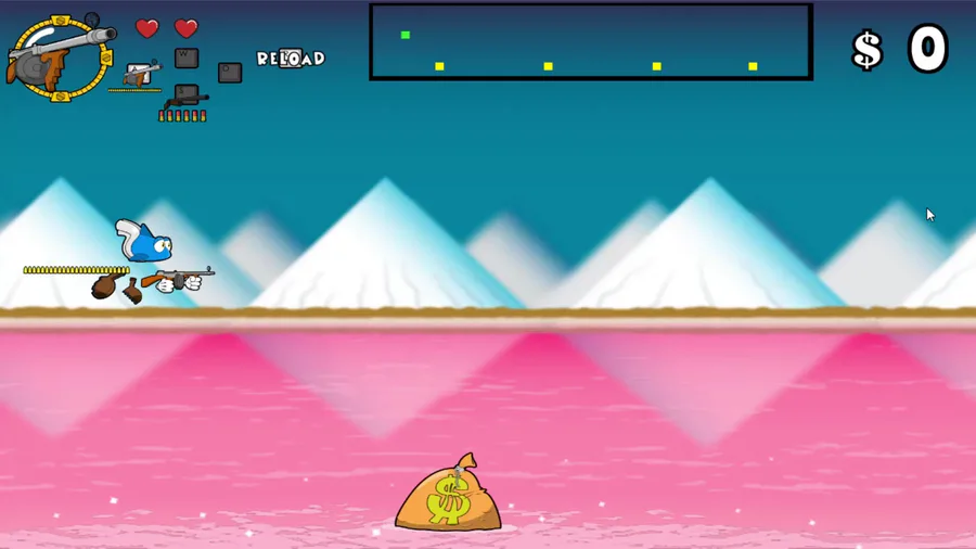
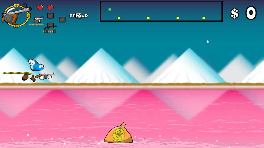
I've been continuing work on my Defender level, and I made a change to the map so players can get a better view of their surroundings. While doing so, I thought that it might be better to have the map on the bottom rather than the top. What do you think?
Hey, it's been a while since I posted an update on my game. Here's a small taste of the Defender-inspired level set in Bonaire. Let me know what you guys think, even if it's something that can potentially worsen my anxiety.
It's been a while since I posted something here. I think it's safe to say that I finished my Defender-style level set in Bonaire. I had to learn new things and put in a lot of work to get things right, but it's finally here.
It's been a while since I posted something. Here's an animated sprite I made of a money bag exploding? Thoughts? Anything I can do to improve it?
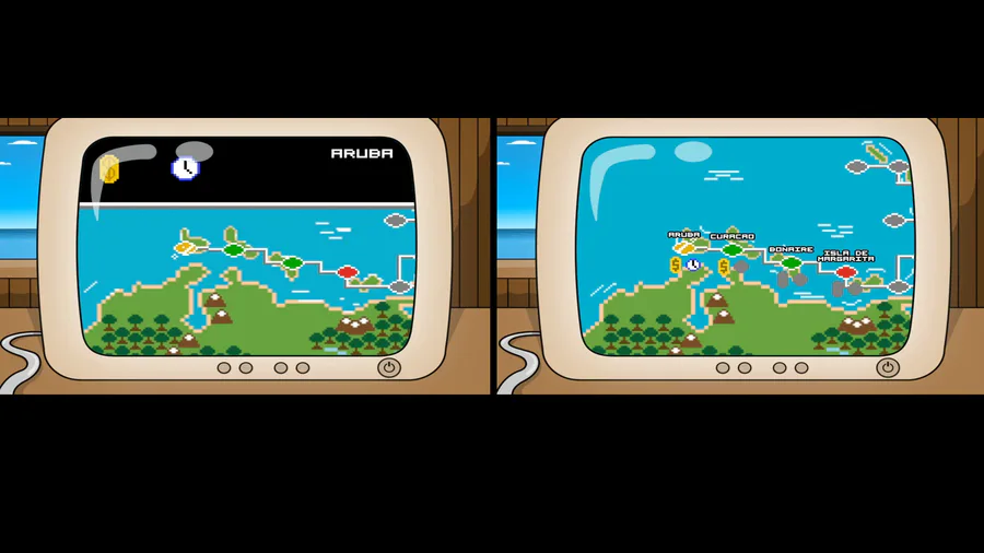
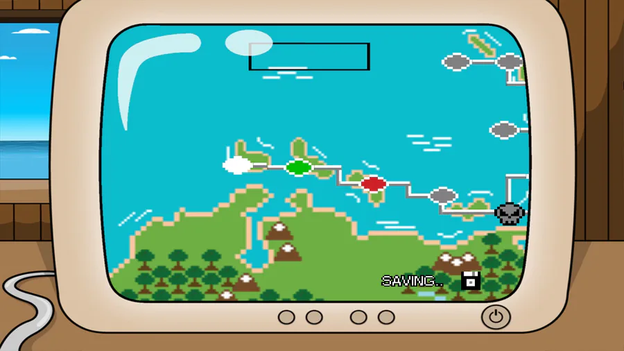
I made some changes to the level-select screen, deciding to go back to using the UI I originally had in mind.
Let me know what you think.



0 comments