2 years ago

Can you guys give me an opinion on this logo?


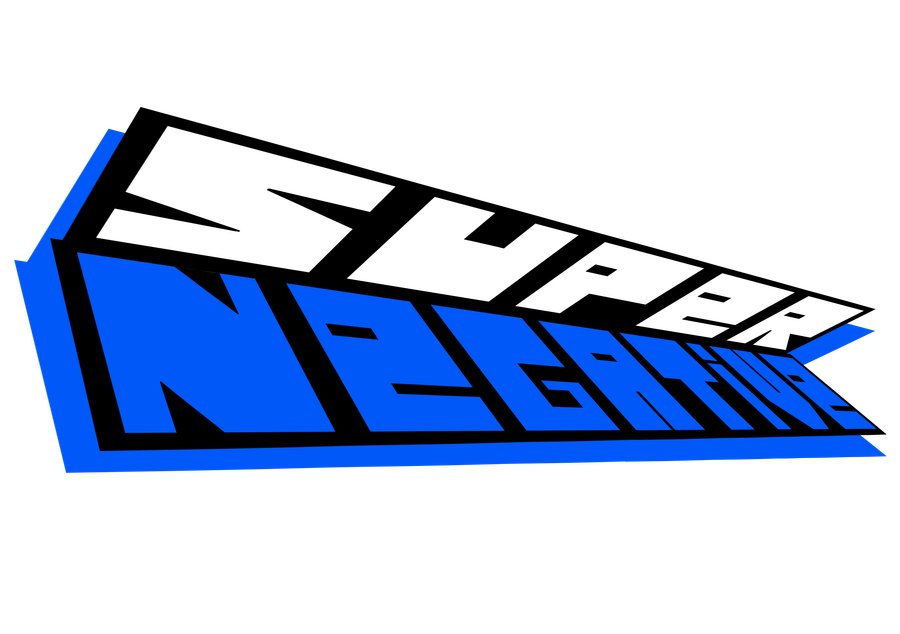
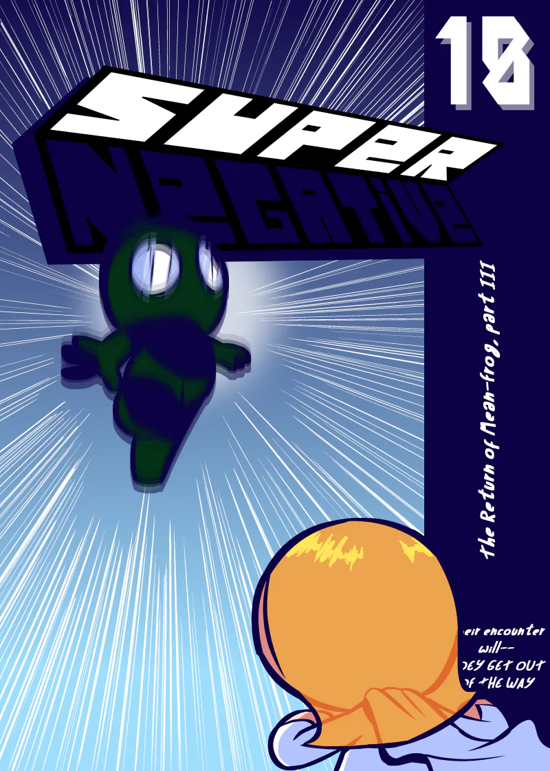
I never thought I'd make an actual "high quality" good looking logo. A shame it's only high resolution and not vector, as it'd make it look high quality at any size.

Honestly, I was feeling the final result was going to look far from what I wanted, and it is, although it actually turned out better than I thought. I had trouble making the "P", "E", "R", "T" and the "V" look good, but at least they still look way better in the final result than they did before I changed their perspective.


13 comments

Loading...

Next up

I'm really sorry for issue 17 taking so long to come out. It's definitely going to be the most disappointing Super Negative issue so far and I'm terribly sorry for that.

Some news about Super Negative

happy silksong day

Super Negative # 15:

The Better Bulleter

I was mad that they made Alastor's 2nd form so lame, so here is my art of scary alastor, straight from the fairytales, not just with some goofy ahh tentacles

I did something.

The hell did I miss?

Wallpaper for my new school device. It's me of course because yes

I think I have finally become addicted to drawing Super Negative.

I mean, I just inked 6 pages in 2 days, without taking any breaks during the process and I'm not even halfway through the day and just inked 3 pages today.

[Image unrelated]