

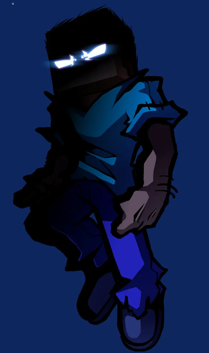
Ps I'll probably just make my own decision (which tbh I'm leaning for outline at the moment) but ya know.
Anyways, examples of characters that already kinda need/have an outline


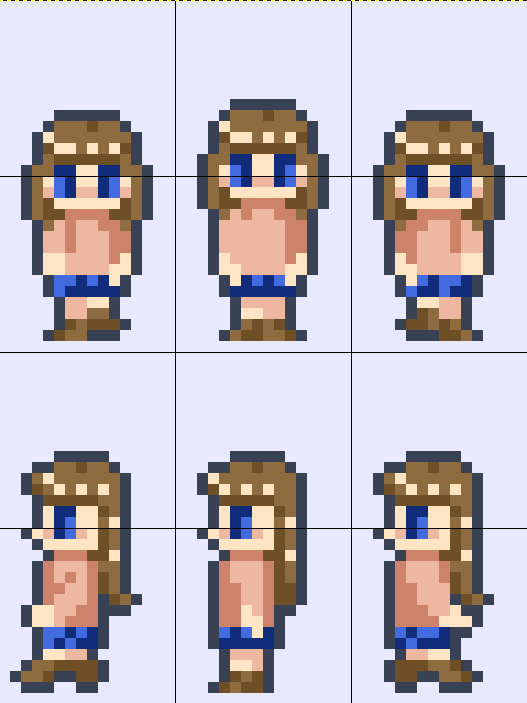
Ok, so there are already some characters who need outlines to make them more visible on lighter backgrounds (examples in article)
But I've been thinking about making an outline for all character sprites.
What do you guys think?
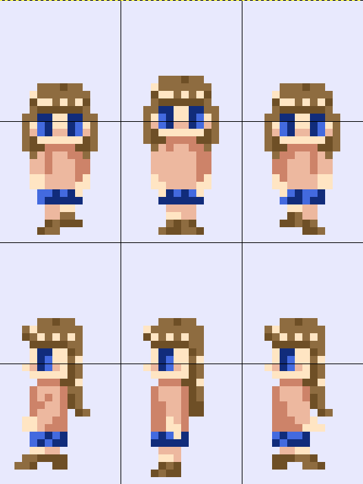
Ps I'll probably just make my own decision (which tbh I'm leaning for outline at the moment) but ya know.
Anyways, examples of characters that already kinda need/have an outline
Happy #WIPWednesday! Are you working on a game? Making some art? Practicing a song? Something else? Tell us in the comments!
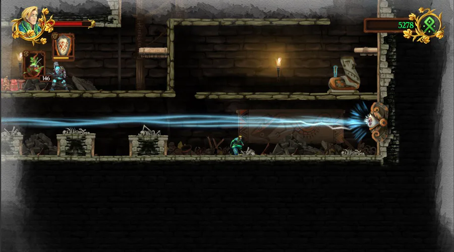
There existed a mod
Called "Dark and Decrepit"
It was really short lived, so it was cancelled
Like with Revibe, I also directed it
So here's some idles and designs I made for it while it lasted
Not a lot, I'm not a fast artist, but still quality art
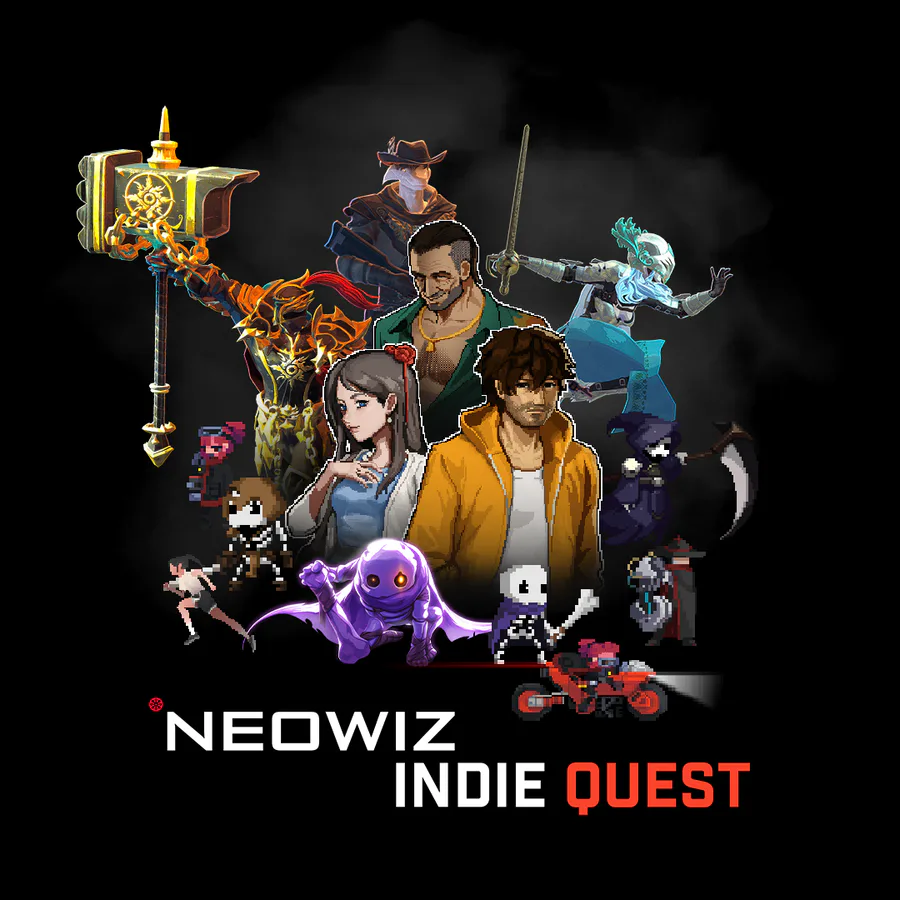
We’re teaming up with Neowiz to support developers with a narrative game jam! The jam kicks off October 31 in the Game Dev community, so join the community and assemble your team: https://gamejolt.com/c/gamedev
Fan art for Foolish I'm feeling kinda better so I drew this
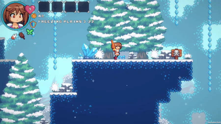
We made a lot of improvements on the Freezing Plains visual. Things like pine trees, tiny bushes, some rocks, and others game props!
#IndieGame | #IndieDev | #GameDev | #PixelArt | #WaifuQuest | #WifeQuest | #screenshotsaturday
Protege el conocimiento, salva la historia. Guardian of Lore es un platformer 2D en el que debes luchar para mantener viva la memoria de la mitología latinoamericana. El juego llegará a Steam el 18 de mayo: https://steam.pm/app/1211740 #ScreenshotSaturday
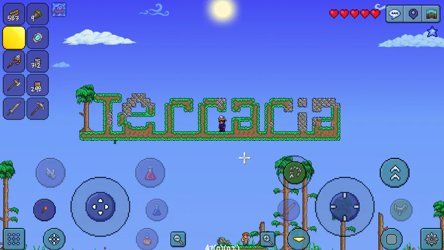
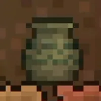
Terraria
Showing off player 2 😎
What do you think?
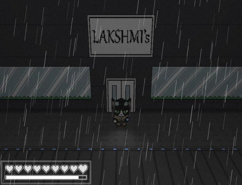
If you have more of an acquired taste, the restaurants in Niravasi have you covered! Maybe skip the salad bar, though.
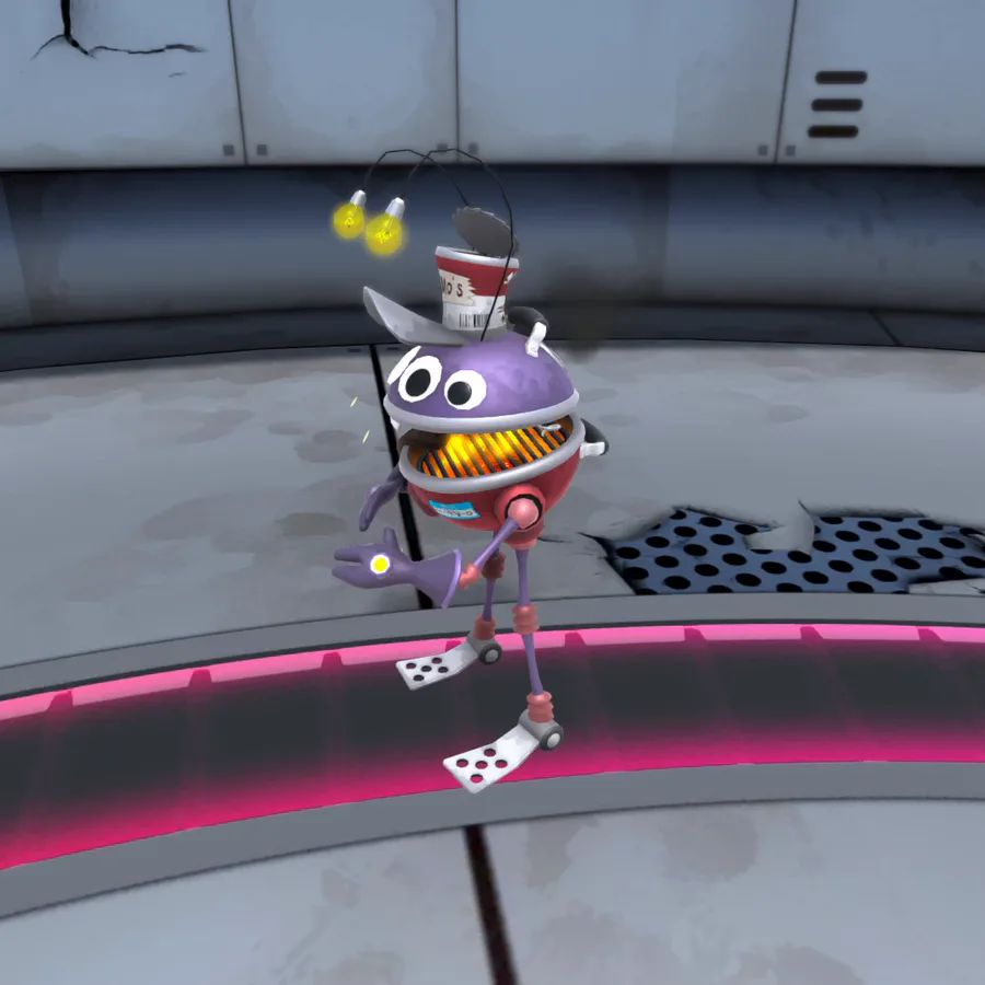
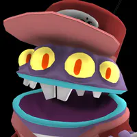
Szayel Aporro Granz - Bleach


6 comments