Ayy!! This is gonna be one out of the multiple pixel art tutorials/ tips I plan on doing. If you'd like to suggest a topic for me to cover, please do! This guide specifically is more focused on character design.
Warning: Lengthy post
I often see a very common thing beginner pixel artists struggle with: Picking the right colors.
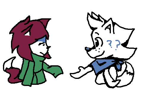
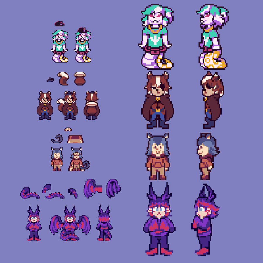
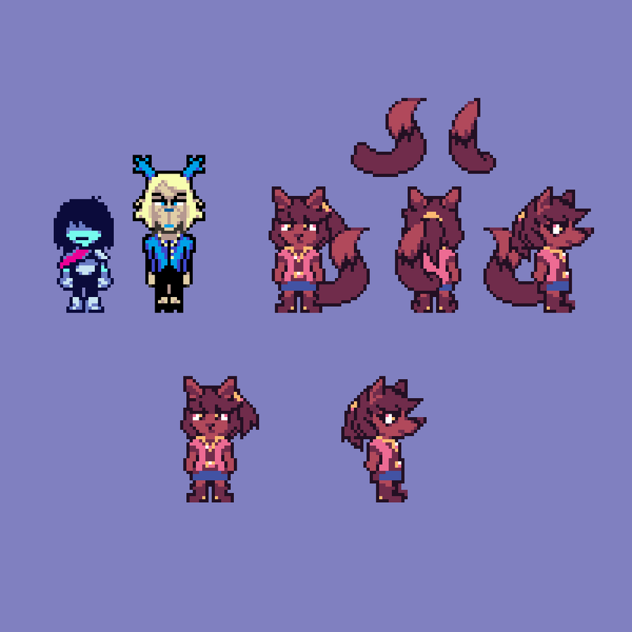
Let's make a new OC for this guide. Meet Puos(pronounced poos)(yes very hehe silly)

What a thing! But uh wait, something's off... Its colors... They don't mix well with eachother! Did it just come from a disco party for depressed people?? What's with the very bright green and purple with the dark redish pink? Weird design overall.
I especially see this so commonly with UT soul human designs where they have a very normal looking guy, but a very vibrant color that's tied to their soul's color. It makes them look so weird and out of place. Their color temperature is wack! Let's take Mig's Cody for example:
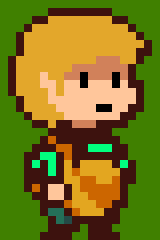
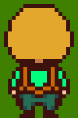
I love you Cody. No one could ever make me hate your underrated debut game, but man is your design just not it. Your two most outstanding colors are yellow and green, but mainly yellow. Peachy skin, blonde hair and apron, and.... what... vibrant green shirt..? Why? That won't do. You give me autumn and casual vibes, sooo why not lean into that? So, I offer you 3 color palette choices!

I, personally, like the red more. You may have noticed that I didn't pick a vibrant red and instead chose a more desaturated redish pink. Now Cody's design is more focused on his very nice puffy hair, rather than the eyebleeding green that was before. Now let's apply that to Puos.
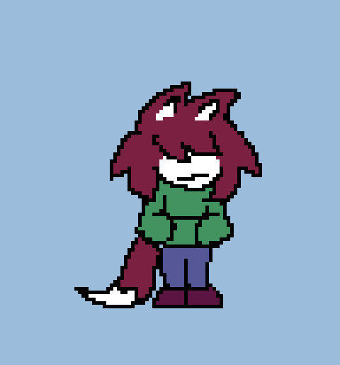
MUCH better!! The colors are a lot more natural and fit Puos' color temperature and theming. You may be wondering why I keep saying "color temperature" and what it actually means. Color temperature refers to how a character can be perceived, purely based on their colors and how closely those colors are to eachother. You wouldn't want a character that's mainly closed off to wear very bright pinks and yellows. You wouldn't want a cheery character to only wear varying shades of black.
"Well okay, so how do I pick my own colors then?"
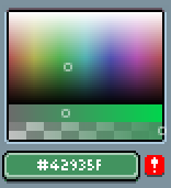
This depends heavily on your character's personality, main emotion, the setting of their environment, etc. and would require me to give a more detailed explanation on color theory, which I really don't wanna do :') But one advice I can give is, for example, if your character leans more towards emo vibes or is closed off, you generally want to use colors closer to gray. Like the blue for Puos' pants for example. I didn't pick a vibrant blue. I picked a more bluish gray
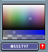
And Puos' sweater? Also a greenish bluish gray!
That's pretty much it for now. If you're thinking about redesigning your OCs after seeing this post, do show me! I may give some more specific advice in replies. So the next time you're designing a character, think about if this really bright red or yellow for a cold character is really something they should wear, or if your character is out in the winter, should they really wear a missing texture shirt?
And for the love of soup please stop making your soul OCs wear the same color as their soul. It doesn't look natural and it sure isn't a "creative decision". If you're gonna do that, at least make the vibrancy of the color not cause eyestrain.
Also Migs don't kill meeeee!!!!












24 comments