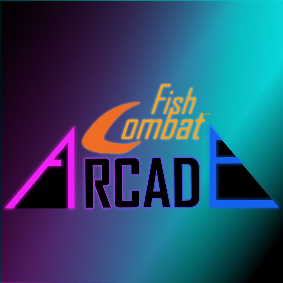
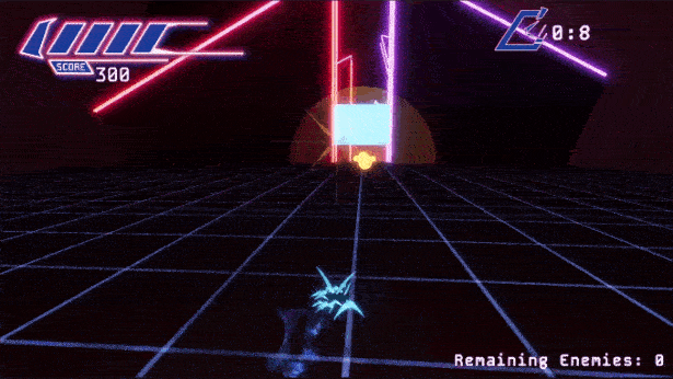
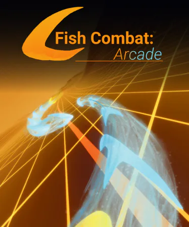
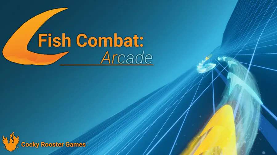
The epic story continues! We are making progress for Fish Combat: Arcade’s logo for our very third DevLog, continuing from the cliff-hanger ending of DevLog 2!!
We have been struggling with how to organize the words. The original idea was to make it look like a fish. The word “Fish” would be the fin, “Arcade” the tail, and “Combat” would be the body.
After agonizing for hours over the “fishiness” of the F, we decided to go with the rule of thumb: Simple is Best. The rest will be all your space for imagination :)
Please let us know of all our graphic design sins by commenting below! Let us know which version is best!
And don’t forget to Follow Fish Combat Arcade right here on Game Jolt to get updates on our progress.














0 comments