Artwork Development
The sketch
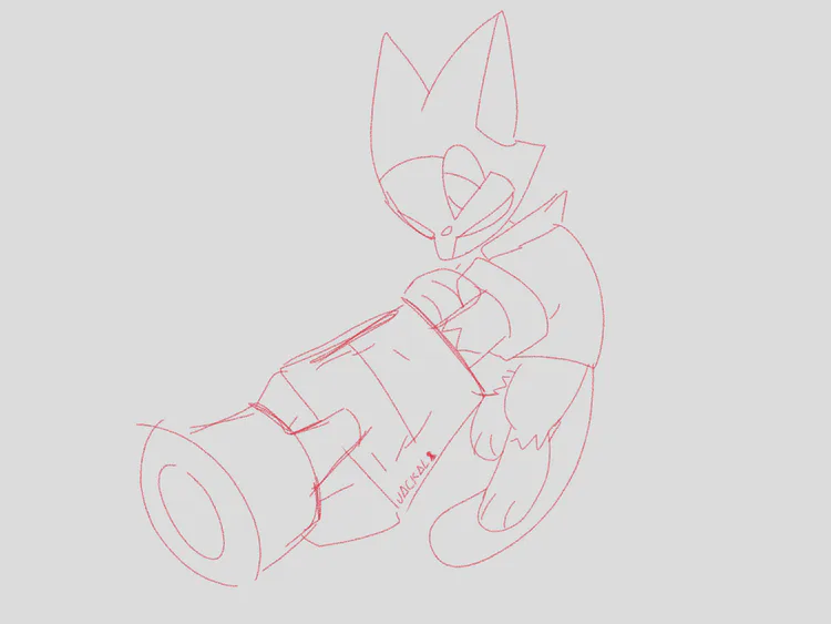
Started with a simple sketch, so I could make the linework
( )
)
The lines
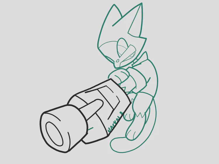
I had to plan on what colours I should use, since the palette is limited and some og colours aren't present on that palette!
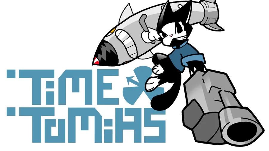
I decided to make the outlines lighter than the fur colour (kinda like the Sonic Battle artstyle), so it wouldn't look too weird.
I had some issues with the gun glove tho, I already started filling the colours and there was no colour that would fit the glove (I didn't use blue because the shirt was going to be blue too), so I changed that specific outline to the darkest colour in the palette so I could use the green from the other outlines to fill it next.
Filling the colours
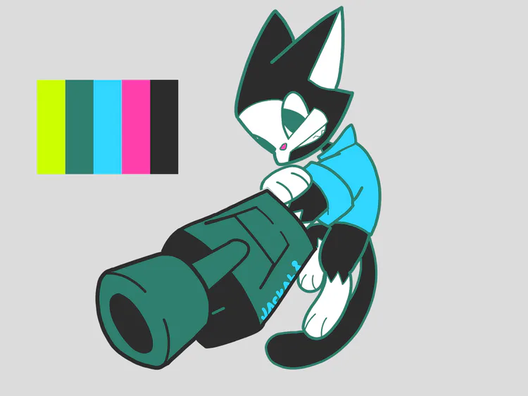
I was going to fill the eyes with black from the palette, but it looked kinda weird, so I went with the own outline's colour instead, and it looked so much better!
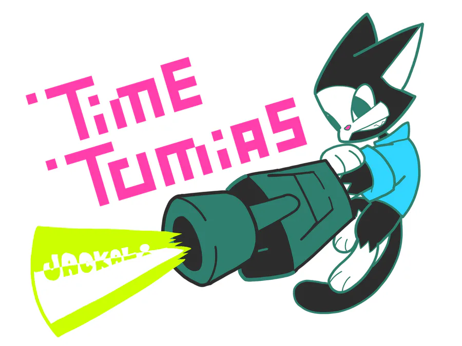
Final results

I haven't used one colour from the palette, so I made a laser with that colour (the lasers are actually lime green on the og colours! So it was a pretty good fit).
And then I put the title for his upcoming game, I picked magenta since I only used it on the nose.
Why did I yapp so much just for this art? Well, I just like to show my progress and how I surpassed the difficulties I've found on the way! 


2 comments